
“The Island satirises the London-centric view of the English capital and its commuter towns as independent from the rest of the country.” From the exhibit “Magnificent Maps” at the British Library
Magnificent Maps: Snow, Taxi cabs, Road Kills, Factory Farming, More Crime!, Victorian Infographics, and the Service Ecology of a City (to name but a few......).
Oh my, what a mélange! OK, so none of these topics is connected to any of the others in any way, other than they are all links to cool maps that you guys have sent to me here-lately. It’s a nice snowy day (where I am, at least!) so a great day to look at cool maps.
Snow Maps - NYC
OK, folks, the links are coming fast and furious! This just in from Holly Porter-Morgan, and it's very pertinent to our snowy conditions today. Take a look, and if the road clearing is bad in your neighborhood, now you have a way to "mappily" address it. JAM
“Thinking about VGI and interactive maps today and I found some great and very timely examples online. Feel free to send around!”
Starting off, we have the official NYC gov effort.
NYC Snow Update
The NYC map is actually the nicest looking, but that may just be my opinion, because so many interactive maps/mash-ups use Google Maps these days and NYC created their own interactive map (not that the rest of us have the time or money to do that). This map offers different symbol styles and colors for different reported problems. It features three categories for a report submission: Stuck vehicle, Street not clear of snow, and Street clear of Snow. On the down side, all categories refer to points and none to lines (which are shown in the third map listed).
Mapping Snow Removal in Brooklyn
Has your street been cleared?
I found this on Brooklyn Vegan under the link ‘Report your Brooklyn Snow Problems- Plot them on an Interactive Map. It won’t get your street plowed any faster, but it might make your feel better’.
This interactive map built on the Google Maps interface, which appears to remain active, displays a point for every submitted problem report. The map viewer can display the reports all in red (All Categories) or choose from the various other point colors to see different types of problems reported: Failure to Remove Snow Reports (purple) , Stalled Vehicles & Other Problems Reports (blue) , and Time of Snow Removal Reports (brown).
Also, going back to the snowstorm just after Christmas, there is the “Roadify Plowed Street Map NYC Dec 2010”, which is still live.
Another map built on the Google Maps interface, the page stated ‘edit the map or tell us and we'll do it for you. Just email info@roadify.com or tweet @roadify’. Kudos to the creators for using Twitter as a way to get information for the map. Roads that were reported as not plowed were indicated in red, with a few plowed roads indicated in green. This map went live on Dec 28th and was last updated on Dec. 30th.
Victorian Infographics

Tinted drawing showing the comparative lengths of rivers and heights of mountains worldwide. In: 'General Atlas Of The World: Containing Upwards Of Seventy Maps,' by Adam & Charles Black, Sidney Hall and William Hughes, 1854; published in Edinburgh by A & C Black.
Here is something else to keep you guys occupied and amused on this snowy afternoon - Victorian infographics! Lesley Kunikis just sent these to me, and they are gorgeous and complicated examples of how crazy people can get graphically. These people had all the patience in the world to construct these diagrams. Check them out - they are really something!
“Here are links regarding Victorian infographics... pretty cool!”
http://bibliodyssey.blogspot.com/2009/12/victorian-infographics.html
http://bibliodyssey.blogspot.com/2008/10/river-deep-mountain-high.html
(scroll down to the earth's crust and mountain graphics on this page):
http://bibliodyssey.blogspot.com/2010/02/variety-pack.html
http://bibliodyssey.blogspot.com/2009/12/victorian-infographics.html
http://bibliodyssey.blogspot.com/2008/10/river-deep-mountain-high.html
(scroll down to the earth's crust and mountain graphics on this page):
http://bibliodyssey.blogspot.com/2010/02/variety-pack.html
Taxi cab travel maps/graphics/diagrams/whatever! VISUALIZATIONS!
And here’s some more!

One-Hour of NYC Taxi Trips in One Graphic
From Matthew Croswell:
“Hey Map Monkey,
This is Matt Croswell (work email). I came across this interesting graphic. Although it is not your traditional map, a group mapped taxi trips between 4-5 PM in Manhattan. Pretty interesting, especially the amount of trips within the same neighborhood.
-Matt”
Note to those of you who don't ride in taxis often: between 4 and 5 PM is the dead zone in trying to get a taxi. 4 PM is when the drivers' shifts change, and taxis in Manhattan are scarcer than hens' teeth!
Also check out this link to other cool taxi ridership maps:
The Service Ecology of a City:
From Amy Trexler:
“This website prevents me from doing work all day long.”
http://observersroom.designobserver.com/johnthackara/entry.html?entry=24268
http://observersroom.designobserver.com/johnthackara/entry.html?entry=24268
Leave it to a zany Dutchman to have a great design blog like this one! Check out his posting called “Spaced Out in a Flat World,” too.

Nutrire Milano (Feeding Milan) is also exploring the relationships between food systems, service innovation, and sustainable urban development. A project of the Slow Food Movement with Milan Polytechnic, Nutrire Milano also uses maps to highlight where there are gaps or blockages in the ways food is produced and distributed.
More Crime Maps!
And, just in from Carrie Beth Lasley (she is in New Orleans):
“The local paper, the Time-Picayune, has been running daily crime maps. This is part of the new Police Chief's effort to engage more with the public. Here's a link to one. They do it district-by-district every weekday on the Web.
http://www.nola.com/crime/index.ssf/2011/01/nopd_1st_district_crime_map_ja_4.html
Carrie Beth”
http://www.nola.com/crime/index.ssf/2011/01/nopd_1st_district_crime_map_ja_4.html
Carrie Beth”
Factory Farms
From Dan Kulakowski:
“I thought this was a pretty cool map, and presented another reason for me to be happy to not live in the middle of the country.”
http://www.factoryfarmmap.org/#animal:all;location:US;year:2007
http://www.factoryfarmmap.org/#animal:all;location:US;year:2007
However, Dan, New York State is not immune from the bad impacts of factory farming, either. As one of the facts on the website states: “The nearly 213,000 dairy cows on factory-farm dairies in New York produce as much untreated manure as 47 million people -- two and a half times the population of New York.” A sobering thought…and believe it or not, the amount of factory farming in NY State has increased quite significantly in the past 10 years, according to the charts on the web page.
Magnificent Maps
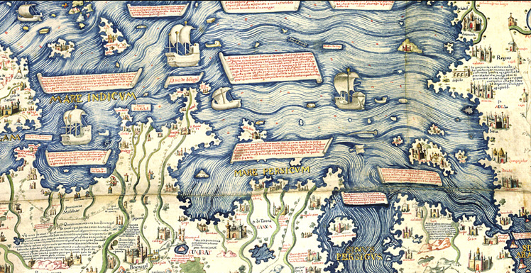
Detail of the Fra Mauro Map, part of the exhibit at the British Library
From Brian Morgan:
“Here's a cool online map exhibit from BBC 4 to spend some time exploring. There's some really nice stuff in here, you might want to pass it along to students or anyone else who might enjoy it.”
This is where you can look in detail at the maps.
Very cool stuff! Check out the “Explore Themes” function when you get to the individual maps, for instance Fra Mauro’s 1450 map of the world.
Very cool stuff! Check out the “Explore Themes” function when you get to the individual maps, for instance Fra Mauro’s 1450 map of the world.
And speaking of the good brother, Fra Mauro, before the spring term starts, and if you have nothing in particular to do to while away the hours, I very much recommend a tiny little book called “A Mapmaker’s Dream: The Meditations of Fra Mauro, Cartographer to the Court of Venice,” by James Cowan, 1996. Very inspirational!

This is the BBC video about the exhibit.
This is something called “MapTube,” sort of the “YouTube” of Maps!
Road Kills
From Holly Porter-Morgan:
“Please send on to the group if you find it relevant.”
This one is about the guy who is mapping road kills on thousands of miles of roads. OK, now for those of you who have taken my fall class in environmental modeling and spatial analysis, you may remember one of the papers I tortured you with (oops! I mean one of the scintillating papers you very willingly read and re-read multiple times) about the mitigation of highway road kills in the Canadian Rockies, and how the favorite paths of the various focal species were estimated by aspect, slope, etc., (remember “expected” versus “observed”?). It seems this poor fellow doing this incredible road kill ground truthing work could benefit from parts of their approach.
And, lastly, Katie Gill sent me this just tonight, which relates, by coincidence, to the same type of highway mitigation project. In fact, one of the species they are most concerned about in this project, the lynx, was one of the focal species from the Canadian Rockies highway mitigation project.
http://www.nytimes.com/2011/01/24/science/earth/24overpass.html?hp
http://www.nytimes.com/2011/01/24/science/earth/24overpass.html?hp
http://www.arc-competition.com/finalists.php Here is the link to all the design entries for the finalists. Some are really innovative.

One of the finalist’s entries in the competition.
Wie of wat u ook wilt (laten) vervoeren: personen, documenten of pakketten, Wie of wat u ook wilt (laten) vervoeren: personen, documenten of pakketten, bij Marcus bent u altijd aan het goede adres. Onze gestage groei danken wij aan een hoge mate van klanttevredenheid. Wie die eenmaal heeft ervaren, wil niet meer anders!bij Marcus bent u altijd aan het goede adres. Onze gestage groei danken wij aan een hoge mate van klanttevredenheid. Wie die eenmaal heeft ervaren, wil niet meer anders!
ReplyDeletewww.marcus.nl