Thursday, August 25, 2011

Irene Plans to Visit New York City This Weekend


Models by NOAA’s National Weather Service show Hurricane Irene pointed right in the direction of New York City this weekend.  First we have an earthquake earlier this week, now an impending hurricane.  Good grief, what’s next, a Plague of Locusts?  It is believed that Irene will also be making a tour of much of the eastern seaboard, and after visiting the New York Metro area, will be continuing on up to Boston and points north.  Depending upon which model prediction ends up being most accurate, it seems as though eastern Long Island will be hit the hardest in this area.  

Model Predictions of Hurricane Irene's Center Tracks for the NYC and Boston areas.

Predictions of Hurricane "cone" as of 1 hour ago.

Going back to 1851, there have been only 5 hurricanes whose centers of circulation have passed within 75 miles of New York City. The last hurricane within that distance from New York City was Hurricane Gloria 26 years ago.
With Irene, there is a threat of high winds, heavy rains and flooding, possible tornadoes, and storm surge/coastal flooding.  Hurricane Irene could be one of those very rare times that New York City experiences a Category 2 or even a Category 3 storm on the Saffir-Simpson wind scale.   


The NYC Mayor is now saying that certain areas in the New York metro area may require evacuations. Advice from the NYC Office of Emergency Management, at:  http://www.nyc.gov/html/oem/html/hazards/storms_evaczones.shtml
http://www.nyc.gov/html/oem/html/hazards/storms_evaczones.shtml

“New York City's hurricane contingency plans are based on three evacuation zones.*  These zones represent varying threat levels of coastal flooding resulting from storm surge.
New Yorkers should find out if their homes, offices or schools fall within the boundaries of a City evacuation zone. The best way to be prepared for the possibility of a hurricane evacuation is to know your evacuation zone and plan your destination and travel routes ahead of time.
To find out if you live in a hurricane evacuation zone, use the Hurricane Evacuation Zone Finder, or call 311. Zones are color-coded and labeled A, B and C when represented on a map. 

·         Residents in Zone A face the highest risk of flooding from a hurricane's storm surge. Zone A includes all low-lying coastal areas and other areas that could experience storm surge in ANY hurricane that makes landfall close to New York City.
·         Residents in Zone B may experience storm surge flooding from a MODERATE (Category 2 or higher) hurricane.
·         Residents in Zone C may experience storm surge flooding from a MAJOR hurricane (Category 3 & 4) making landfall just south of New York City. A major hurricane is unlikely in New York City, but not impossible.
* Hurricane evacuation zones should not be confused with flood insurance risk zones, which are designated by FEMA and available in the form of Flood Insurance Rate Maps (FIRMs). You can determine whether you live in a flood insurance risk zone by calling the Department of City Planning at 311.
Let's all hope that this one just passes us by without too much trauma.  But in case it does not, be prepared for the storm.  Be safe.  No Hurricane Parties, everybody.  

Sunday, August 21, 2011

Indiana Jones World Map


Map by Matt Busch
  
Continuing in the vein of cool videos, I am posting here a short one on the making of the Indiana Jones World Map.  I jest not.  And the video is quite interesting, especially among those of us who had the pleasure of seeing the first Indiana Jones movie some 30 years ago during our formative years.  The movie made a big impression on me at the time, because, unlike the artist of the World Map, I actually loved history, geography, and archaeology!  And those movies (nevermind that they were complete fantasies!) fed those habits, and added in a healthy dose of action and adventure and exotic goings-on.  What’s not to love about Indiana Jones? 
     In the video, Matt Busch, the map artist, discusses the genesis of the map from a sketch, and how he symbolized the map, created the detailed legends, and added the basemap context to the map.  It's pretty nicely organized. And he was fairly fanatical about the research that went into it, as evidenced by his copious notes and charts.  I nominate Matt to the Legion of Honorary Cartographers for this effort.  
            You can view the map in more detail at http://mattbuschstore.com/products-page/posters/indiana-jones-world-map/, but be forewarned to avoid disappointment: the 250 signed copies of the map are already sold out.  


Thanks to the History Blog for posting the video and the story at http://www.thehistoryblog.com/archives/12438

Friday, August 19, 2011

Le Flâneur


Le Flâneur
A project by Luke Shepard, a student at The American University of Paris.  Composed completely of photographs.  Location: Paris, France; Camera: Nikon D90; Music: Intro by The XX (thexx.info).   Thanks to Urban Demographics for posting this video.                                                                                                   Le Flâneur – what is a Flâneur, anyway?  Le Flâneur is a term normally ascribed to a male stroller who gathers a reading of urban space through arbitrary exploration; the Flâneur figure as a contemplator of urban space.  In French, the word means “stroller,” “loiterer,” “lounger,” “loafer,” or “saunterer.”  There really is no direct English translation.  Charles Baudelaire developed a derived meaning of flâneur—that of “a person who walks the city in order to experience it.” 
Baudelaire's aesthetic and critical visions helped open up the modern city as a space for investigation, while other theorists codified the urban experience in more sociological and psychological terms.  In his essay “The Metropolis and Mental Life,” Georg Simmel theorizes that the complexities of the modern city create new social bonds and new attitudes towards others.  The modern city was transforming humans, giving them a new relationship to time and space, inculcating in them a “blasé attitude,” and altering fundamental notions of freedom and being
         One of the reasons the concept of Flâneur-ism is typically associated with men is that until quite recently women did not have the ability to wander safely and unaccompanied and anonymously through the city, and go wherever they pleased.  Many areas were off-limits to women, for one reason or another.  Therefore, le Flâneur was almost always a male, since being able to move through the city anonymously and without attracting undue attention is one of the pre-requisites, in fact it is the hallmark, of Flâneur-ity.  It is also the reason why, throughout time, certain bold women have decided to masquerade as men, to have access to that type of urban observer anonymity and jettison all the restrictions that normally devolved upon their gender. 
So, we have here, for your viewing pleasure, a couple of time lapse videos.  The first one (above) is of Paris, the original home of the Flâneur, and the second one (below) is of New York City.  These are two of the greatest cities in the world, the first the cultural capital of the world in the 19th century, and the second the cultural capital of the world in the 20th century. 

Time Lapse Photography of Brooklyn & Manhattan, New York City (with 9/11 tribute)  All production: Tal Kagan; Blueglaze LLC (blueglaze.com)
Music: Adele - Hometown Glory (Chewy Chocolate Cookies Remix)


Time Lapse of NYC 1812-2013

I couldn’t resist adding in a third time lapse video, this one a model of the built environment of New York City, 1812-2013.  Music by Jay-Z and Alicia Keys – Empire State of Mind


OK, based on a reader's comment below, I have added a FOURTH video, this one is not time lapse, but the tilt shift technique, NYC in miniature. For details on how this technique works and an interview with the artist, see:  
http://aerofilm.blogspot.com/2010/02/sandpit-short-film-by-aero-director-sam.html
Thanks, Amy Trexler, for sending us the link to the Sand Pit a couple of years ago, and thanks, Joanneseale, for bringing it to our attention again! 


Tuesday, August 16, 2011

Worldwide Map of Stress to Coral Reefs


Worldwide Map Identifies Important Coral Reefs Exposed to Stress

“Marine researchers from the Wildlife Conservation Society and other groups have created a map of the world's corals and their exposure to stress factors, including high temperatures, ultra-violet radiation, weather systems, sedimentation, as well as stress-reducing factors such as temperature variability and tidal dynamics, that will help identify coral reef systems where biodiversity is high and stress is low, ecosystems where management has the best chance of success.  
The exposure index ranges from 0-1, with green indicating sites with a low exposure index (most likely to benefit from management), and red indicating sites with a high exposure index (less likely to benefit from management).”  From: http://www.sciencedaily.com/releases/2011/08/110811162835.htm
Thanks, Holly Porter-Morgan, for sending the link and the blurb. 
             For more information about how the exposure index was developed, see the source publication cited below. 

Source publication: Joseph Maina, Tim R. McClanahan, Valentijn Venus, Mebrahtu Ateweberhan, Joshua Madin. Global Gradients of Coral Exposure to Environmental Stresses and Implications for Local Management. PLoS ONE, 2011; 6 (8): e23064 DOI: 10.1371/journal.pone.0023064

Monday, August 15, 2011

Libya Conflict Map


Conflict map of Misrata, third largest city in Libya (population 300,000), showing events during the siege in April.

 This is the link to an excellent Interactive Map showing conflict events in Libya from February 20, 2011-August 15, 2011. (Thanks for sending the link, Suman Basyal)

Interactive Map of Libya’s Tribal Regions:

 Here is a rather depressing and sobering pie graph, based on a survey taken in June, 2011.
  
Americans unaware of U.S. / U.N. bombing in Libya


UPDATE AS OF AUGUST 28, 2011


Thursday, August 11, 2011

Fun with Map Projections, Oblique Case


Lambert cylindrical equal-area projection with oblique orientation from: https://www.cia.gov/library/publications/the-world-factbook/geos/xx.html 

Isn’t this a fantastic map projection?  It’s called a “Cylindrical Equal-Area Projection, Oblique Case.”  Kristen Grady sent it to me, (it's apparently what the CIA uses to map global data) and I figured it was a good opportunity to think a little bit about map projections, and of course, share my thoughts with you, dear readers. 
First of all, a simple definition of a map projection: “A cartographical map projection is a formal process which converts (mathematically speaking, maps) features between a spherical or ellipsoidal surface and a projection surface, often flat.” From: http://www.progonos.com/furuti/MapProj/Dither/CartDef/MapDef/mapDef.html#Oblique

One of the reasons that I believe the topic of map projections is so confusing to people (both those trying to teach it and those trying to learn it) is that there are so many different ways to classify the types of projections, and by necessity, every projection falls into several different categories simultaneously. 
Projections are classified by which property of reality they preserve the best.  All projections distort the globe, but some are better at depicting “true” area (equal area or equivalent projections); distance (equidistant); direction; and shape (conformal); etc.  There are also so-called “compromise” map projections, which don’t preserve any property entirely, but minimize distortion in all. 
Projections are also categorized by which “projection surface,” or “developable surface” is used to create the flat map from the spherical globe.  For instance, azimuthal (a flat plane touching the globe with one point of tangency); cylindrical (wrapped around the globe in a cylindrical shape, with one line of tangency); conic (yes, you guess it, a cone sitting on the globe like a conical birthday hat, with two lines of tangency). 
 These are the three most common, but there are also sinusoidal, pseudo-cylindrical, such as the now-familiar, but still strange-seeming Goode’s interrupted homolosine (shown at left), and “others,” such as Buckminster Fuller’s Dymaxion, which projects onto the surface of a polyhedron.  
Buckminster Fuller's projection on a polyhedron. Projections are also classified as to how the developable surface is oriented on the globe.  There are normal (aligning with the earth’s axis), transverse (at right angles to the earth’s axis), and oblique (aligning with a Great Circle, but not the Equator or a meridian), and each different orientation has different lines of latitude or longitude where scale is “true.”


Above, left: cylindrical "normal": Above right: cylindrical transverse; lower left: cylindrical oblique.
Then, to complicate matters even further, the "developable surface" can be "tangent," considered to have points or lines of tangency where it is touching the globe, or it can be "secant," which means the developable surface seems to be slicing through the globe. Secant projects have the advantage of additional points of tangency, and therefore more areas on the map that are "true."
And, then, we have projection classification by method of light source: from where, in our imaginary transfer of data from the face of the globe to the projection surface, is the light coming?  There’s Gnomonic (light projected from the center of the globe to projection surface); Stereographic (light projected from the antipode of point of tangency); or Orthographic (light projected from infinity).
            The above is a vast simplification of projection categories, and omits a great deal of detail and nuance.  But overall, it hits the highlights.  Some pretty good projection typologies are given at http://www.progonos.com/furuti/MapProj/Dither/ProjTbl/projTbl.html and at http://egsc.usgs.gov/isb/pubs/MapProjections/projections.html and at http://www.kartografie.nl/geometrics/map%20projections/body.htm

So, to return to our interesting “cylindrical equal-area projection, oblique case,” what this means when we break it down is that the developable surface is a cylinder (like many more common projections, including the Mercator, the Lambert, and the Miller).  It s an area-preserving projection, like the Gall-Peters, so areas are shown “true” to size (with many caveats), but “true” shape and distance are sacrificed.  And the developable surface is oriented in an oblique fashion, resulting in those nice sinuous lines of lat-long that are so unusual to see on a world map.  A projection using the Oblique Case usually implies that the cylinder, for instance, is oriented so that the equator is not the line of tangency, as in the “normal” projection, nor is it transverse, where a line of longitude would be the line of tangency.  In an oblique case, the line of tangency is one of the Great Circles.  An oblique map has neither the polar axis nor the equatorial plane aligned with the projection system.

Other Cool Oblique Case Projections:

Mollweide Projection, Oblique Case


The Atlantis Map (Bartholomew, 1948), an Oblique Mollweide projection, features the Atlantic Ocean as the major focus.

“If neither Equator nor the central meridian are aligned with and centered on the map axes, the result is commonly called an oblique projection (or, more properly, an oblique map).  Although general properties of the original projection (like area and shape equivalence) still hold, those depending on the graticule orientation are generally not preserved.  A common reason for tilting a projection is moving a large, important area to the places of lesser distortion. The Atlantis map (Bartholomew, 1948) presents the Atlantic Ocean in a long, continuous strip aligned with the map's major dimension. Also clearly showing the Arctic ‘ocean’ as a rather small extension of the larger Atlantic, it is an oblique Mollweide projection centered at 30°W, 45°N.” From: http://www.progonos.com/furuti/MapProj/Dither/ProjObl/projObl.html#ObliqueRectangular

The Hammer-Aitoff Projection, Oblique Case
“The Hammer-Aitoff map projection is an equal-area map projection which displays the world on an ellipse.  This map was created from a hemisphere of the equatorial case of Lambert's Azimuthal Equal-Area projection using a trick similar to the method by which the Miller Cylindrical projection was made from the Mercator projection.  This projection is also popular in the oblique case.  The basic idea behind the Hammer-Aitoff projection is simple enough: first, place the whole world in one hemisphere by the simple expedient of dividing all longitudes by two, then to compensate for that, stretch the map out twice as wide.”  From: http://www.quadibloc.com/maps/meq0801.htm  

Oblique Mercator
“This is used to show regions along a Great Circle other than the Equator or a meridian, that is having their general extent oblique to the Equator.  This kind of map can be made to show as a straight line the shortest distance between any two preselected points along the selected Great Circle.  Distances are true only along the Great Circle (the line of tangency for this projection) or along two lines parallel to it.  The map is conformal, and rhumb lines are curved.  Developed by Rosenmund, Laborde, Hotine et al.”

Space Oblique Mercator
“This new space-age conformal projection was developed by the USGS for use in Landsat images because there is no distortion along the curved groundtrack under the satellite.  Such a projection is needed for the continuous mapping of satellite images, but it is useful only for a relatively narrow band along the groundtrack.  Space Oblique Mercator maps show a satellite’s groundtrack as a curved line that is continuously true to scale as orbiting continues.  Developed in 1973-79 by A. P. Colvocoresses, J. P. Snyder, and J. L. Junkins.”  From: http://www.geomart.com/articles/mapprojections.htm
This Space Oblique projection is also used in the Cassini Spacecraft’s radar altimetry and synthetic aperture radar (SAR) imaging, which recently mapped Saturn’s moon Titan, for instance.

Mosaic of Cassini RADAR image coverage of Titan.  The Cassini image strips are made available in map projected form and use the Oblique Cylindrical projection oriented along its individual flyby ground track.  Mosaics of multiple image strips  transformed to a common global map projection are being made. From: http://www.isprs.org/proceedings/XXXVII/congress/4_pdf/173.pdf  “RADARGRAMMETRY ON THREE PLANETS,” by R.L. Kirk and E. Howington-Kraus, Astrogeology Program, U.S. Geological Survey, The International Archives of the Photogrammetry, Remote Sensing and Spatial Information Sciences. Vol. XXXVII. Part B4. Beijing 2008.

The Math Involved:
            Now, I know there are math geeks out there (several of whom were in my recent classes, and always clamoring for “more math”!) so this is for you, guys:

An oblique form of the cylindrical equal-area projection is given by the equations:

         
And, here are some tres cool maps that use unusual projections which I found when poking around on the Internet:

Azimuthal Equidistant Projection Centered Near Khartoum. Map, 1942.


  This is a map of Human Migration, using the Dymaxion Projection.  The choice of this particular projection highlights the interconnectedness of the land masses of the world, and makes it easy to see the flow of humankind over the centuries.  

Another one based on the Dymaxion Projection! and I suspect for the same reason as the Human Migration map. This one portrays a prediction of the energy grid of the future, with various types of energy sources named.

A map of Faunal provinces based on Maurer’s star projection presents all lands minus Antarctica.  Since climate is a great determinant of faunistic features, most regional borders follow latitudes and are, therefore, roughly concentric in polar-aspect maps. 


Cassini's projection is a transverse aspect of the plate carrée, here with central meridians 70°E and 110°W.

And, just for kicks, here is the Cassini Projection, developed by César-François Cassini de Thury in 1745.  This is the son of the guy for whom the Cassini spacecraft was named (Giovani-Domenico Cassini), even though NASA is not using his projection to map the data, but rather an oblique conformal projection.  But Cassini (the elder) was the first to observe and document Saturn’s moons, and that’s probably why they named the spacecraft after him.  He also began the work to create a comprehensive topographic map of France, work that was completed by his son and grandson over a century later.  He used the then-new method of triangulation and his own method of determining longitude, which meant that this was the first truly accurate map of France.  Unfortunately, this accuracy resulted in a much smaller France than the Sun King Louis XIV (who commissioned the survey) was expecting.  Apparently the King joked that Cassini had taken more of France from him than he had won in all his wars. It was the first topo map of an entire country.
           Cassini’s projection is the transverse aspect of the equi-rectangular projection, in that the globe is first rotated so the central meridian becomes the “equator,” and then the normal equi-rectangular projection is applied.  It maintains scale along the central meridian and all lines parallel to it, and is neither equal-area nor conformal.  It is best suited for mapping areas predominantly north-south in extent near the central meridian.   Formerly used by the Ordnance Survey in Great Britain, Cassini is still used in Cyprus, Czechoslovakia, Denmark, Germany, and Malaysia.  


An application of the Cassini Projection - Present and fossil teeth suggest several migration waves in the past, when reduced sea levels created bridges between now isolated Japanese and Aleutian islands. From: 
Christy G. Turner II, Teeth and Prehistory in Asia, Scientific American 260 (2), February 1989. 

And to end up on a humorous note, here is a part of a poem about, of all things, maps! and their use (or not!) in navigation

From Lewis Carroll's 1876 The Hunting of the Snark - an Agony in Eight Fits:

Fit the First - The Landing

...Navigation was always a difficult art,
Though with only one ship and one bell:
And he feared he must really decline, for his part,
Undertaking another as well

Fit the Second - The Bellman's Speech

...He had bought a large map representing the sea,
Without the least vestige of land:
And the crew were much pleased when they found it to be
A map they could all understand.
"What's the good of Mercator's North Poles and Equators,
Tropics, Zones, and Meridian Lines?
So the Bellman would cry: and the crew would reply
"They are merely conventional signs!
"Other maps are such shapes, with their islands and capes!
But we've got our brave Captain to thank"
(So the crew would protest) "that he's bought us the best –
A perfect and absolute blank!"...


UPDATE - September 10, 2011: Map Monkey has instituted a map projection identification contest! For details, see http://geographer-at-large.blogspot.com/2011/09/name-that-map-projection.html


Tuesday, August 9, 2011

London Calling - The 2011 Riots


Locations of some of the violence in the London environs, August 2011. 

OK, after my very extremely civilized time in London a couple of weeks ago, all hell has broken out, and I really don’t know what to make of it all.  I have e-mailed my friend in London, Natalia, who lives in Brixton and works in the City, mainly to find out if she is OK, and get her take on what is going on.  Her response was not reassuring, including an anecdote about a youth’s threatening behavior towards passengers on the train she was on, and her packing up what we in NYC after 9/11 called a “go-bag.”  Not cool. And as usual, the media in this country are not telling us any useful information.  


August 8, 2011


August 9, 2011


Here is a Google map of Day 2 of the riots. 
and August 6-9, 2011

The Guardian is keeping an updated Google map in their "Data Blog - Facts are Sacred" page at  http://www.guardian.co.uk/news/datablog/interactive/2011/aug/09/uk-riots-incident-map

Here is a blog about what’s going on in Birmingham, too, including videos.  http://birminghamriots2011.tumblr.com/

Oh, and this just in, an interesting essay appeared yesterday in the blog New Geography at http://www.newgeography.com/content/002376-britain-needs-a-better-way-get-rich-than-looting?utm_source=feedburner&utm_medium=feed&utm_campaign=Feed%3A+Newgeography+%28Newgeography.com+-+Economic%2C+demographic%2C+and+political+commentary+about+places%29

Britain Needs a Better Way to Get Rich Than Looting

Monday, August 8, 2011

Map Addict


Example of an Ordnance Survey Map.  One inch map of England and Wales - New popular edition. Sheet 176: Exeter  - Chessington: Ordnance Survey, 1946.  Scale of original: 1:63,360 (one inch to a mile). From:http://www.devon.gov.uk/de/print/index/cultureheritage/libraries/localstudies/lsdatabase.htm?url=etched/etched/100239/1.html

OK, if you are reading this, then you, like me, are probably a Map Addict to some extent or another.  As with any obsession/compulsion, map addiction takes many forms and there are many degrees of addiction.  And there are no 12-step programs to cure people of map addiction, because, well, quite frankly, we don’t want to be cured! 
I have just finished reading Map Addict, by Mike Parker, which was recommended to me by Gretchen Culp before I left for England.  She thought I would enjoy it because 1.) I am a map addict; 2.) she enjoyed the book (and is also a map addict); and 3.) it pertains largely to England and Wales and the U.K. Ordnance Survey (OS) maps, and I was just heading off to England.  I found out about this book too late to include it in my list of “Geography Beach Books” for summer reading, which I posted back in May of this year (see http://geographer-at-large.blogspot.com/2011/05/geography-beach-books.html) so I would like to amend the list by saying it is definitely worthy of being added.  Since I just returned from England (and from reading this book), I thought it was fitting to provide a little review of it.  The little review then blossomed into an all-out mini-dissertation on the book.  In the style of the book’s author, one thing led to another as I was writing this review, and before you know it, I was off on a zillion tangential digressions.  That’s the way it is with maps – somehow they inspire a fascination with, well, nearly EVERYTHING, exploring all possible paths and going down seemingly unrelated avenues and blind alleys, regardless of how far afield they may take us from the original route of the journey.  THAT is one of the joys of map addiction – endless hours spent poring over maps, even if the map is of a place where you have very little likelihood of ever going in real life.

Mike Parker, a self-professed map addict, writes in an engaging and informal style, detailing his life’s obsession with maps in terms that most of us who also fall into the map addict category can certainly relate to.  I definitely count myself in that group, and I suspect that many of you who are reading this do, as well.  Throughout the book, he discusses many of the fascinating aspects of maps, from the perspectives of politics, gender, and religion, among other connections.  Much of this is told with a decidedly British focus, as filtered through the lens of someone who grew up in a certain place in a certain time.  Nevertheless, even for a non-Anglophile, it is quite interesting and even at times illuminating. 
            The author starts by describing the origins of his map obsession, which began for him as a child who had discovered and fallen in love with the British Ordnance Survey maps.  His raptures about these maps may not be well-understood right away by those readers who have not had a first-hand experience with the OS maps themselves, but Mike does a good job of explaining what makes these maps so wonderful and special.  They are not only extremely detailed - in the larger scales showing every little farmstead and outbuilding and country lane - but are also aesthetically beautiful and models of clarity and good cartographic design.  Their color and symbolization schemes are amongst the best ever invented.  He talks about the history of the Ordnance Survey itself, going back to the 18th century, the major personalities involved in the initial Survey, and all the trials and tribulations of getting the Survey accomplished, from the technical as well as the political standpoints.  Interspersed throughout the more factual aspects of the account are the author’s personal ruminations about mapping and the love of maps, which I found generally delightful, not the least of which because I happen to agree with most of them! 
           
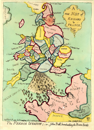
“James Gillray’s map of England as King George III, crapping ‘bum boats’ into France’s mouth”

The second chapter deals with the national rivalry between France and England in all things, not the least of which is cartography, owing to its ramifications for national security and military operations of these two historic “frenemies” who face each other across this narrow body of water (the countries are only 21 miles apart at its narrowest point) called alternatively the English Channel in the U.K., or la Manche in France.  Therefore cartography and having the most up-to-date spatial information about coastlines, etc. has played a large role over the centuries in both English and French politics.  Mike regales us with the very convoluted and somewhat humorous (at least to the victors!) tale of the international commission that ultimately established Greenwich, England as the location of the Prime Meridian - this despite the valiant efforts of the French representative to locate it in Paris.  This was the culmination of a long-standing feud about the standardization of Longitude 0o 00’ 00” and although many countries had their own Prime Meridian in use for navigation, only England and France, for various reasons, had any “real” and legitimate claim to having their locations recognized and used internationally. 

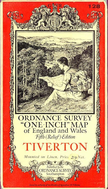
Cover of an Ordnance Survey Map, 1 inch to the mile series, from 1889.

The third chapter reverts back to a more in-depth look at the Ordnance Survey maps, and Mike selected (given with painstaking rationales) his top five OS maps, and more entertainingly, his pick of the worst five.  I have had the utmost respect for and admiration of the OS maps over the years, but this chapter really did open my eyes as to why the Ordnance Survey is unique in the world of national mapping agencies and their products, and permitted a level of appreciation of these maps that heretofore was more intuitive on my part rather than based on objective measures.  He also goes into all the different series of maps available over the years, in the different scales, and the advantages and disadvantages of each, as well as an analysis of the cover designs of the maps, and a history of changes to the design and perceived purpose of the maps.

Enclave/Exclave of Madha and Nahwa.  Source: Wikipedia entries for Madha and Nahwa.

I found Chapter Four, “Borderline Obsession,” extremely fascinating – it’s about borders, enclaves and exclaves.  An enclave is a territory (or part of one) completely surrounded by another territory.  Usually (but not always) an enclave is also an exclave (i.e. a part of a territory not connected to its ‘mainland’), so both terms are often used interchangeably.  This chapter reminded me in parts of a section of the Frank Jacobs’ book Strange Maps: An Atlas of Cartographic Curiosities, that deals with the same topic.  Also, see Frank’s website for another discussion about the strange phenomena of exclaves and enclaves.  He has several posts on the topic of exclaves/enclaves, here are a couple of the best ones: http://bigthink.com/ideas/21160  (“Cooch Behar, the Mother of all Enclave Complexes,” on the India-Bangladeshi border);  http://bigthink.com/ideas/21109 (on Madha and Nahwa on the Arabian peninsula);  http://bigthink.com/ideas/24238  (Switzerland/Italy).  Another blogger who has taken up the topic of exclaves/enclaves and borders in general is the Basement Geographer, in posts such as “The Legacy Enclaves of Portuguese and French India,” at http://basementgeographer.blogspot.com/2011/06/legacy-enclaves-of-portuguese-and.html  (one of which is Pondicherry, where one of my top viewers is located!).
This chapter on borders also expounds upon what has happened in England throughout the past decades in revising county names and county borders and the impact on issues of civic pride, heritage, and nostalgia for times past.  He does a very good job of framing many of the pressing problems of the current day in terms of place/space, and of course, maps. 
“The Power Map,” Chapter 5, is a really nice synopsis and expansion of many of the ideas popularized by geographers such as Mark Monmonier, Danny Dorling, Denis Wood, and others in various books about the “power of maps” – how maps have been used throughout the centuries to achieve political ends, to promote propaganda, and in general to influence ways of thinking about our world.  Mike Parker explains how no map is truly objective or totally factual, and how every map distorts.  He talks about what is included and what is left out of maps (and why), as well as reviews the whole map projection controversy, which for a time was a vehement debate between supporters of equal area projections such as the Gall-Peters projection, vs. the traditional Mercator projection, which ostensibly promotes a Euro-centric, Imperialist, “northern” superiority.  (For a humorous look at this, see my recent posting on “Freeing the Prisoners of the Mercator Projection” at http://geographer-at-large.blogspot.com/2011/06/freeing-prisoners-of-mercator.html) .  The issue of the subjectivity of north being “on top” is also discussed in terms of the greater political and psychological ramifications, and how worked up people can get about changes to the traditional way of mapping the world.  It is very disturbing!  It can put people into a tailspin and it turns their worldview upside-down! 

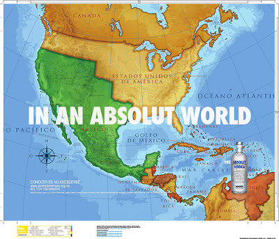
“The controversial Absolute vodka ad, showing Mexico in its pre-1848 borders”

Changes to the standard map can be hazardous to a fragile or insecure self-image, as with what happened when Absolut Vodka had an advertising campaign that featured a map of the U.S. and Mexico that depicted the borders of Mexico as including all its former possessions in California, Texas, Nevada, Arizona, and New Mexico and parts of Utah, Colorado, and Wyoming, before it lost those territories to the U.S. in 1848 in the aftermath of the US-Mexican War.  Some Americans got very riled up by this, and flushed their Absolut Vodka down the toilet.  The ad was such an affront!  You can read some of the outraged comments on the website where Absolute Vodka’s “apology” or explanation or whatever is posted.  Some very interesting points are raised about what constitutes an “ideal view of a country.”  http://www.freerepublic.com/focus/f-news/1996876/posts  
Absolut’s explanation: “We have received many comments on an ad showing what an ABSOLUT [i.e., a perfect] world would look like from a Mexican point of view......The In An Absolut World advertising campaign invites consumers to visualize a world that appeals to them -- one they feel may be more idealized or one that may be a bit ‘fantastic.’… This particular ad, which ran in Mexico, was based upon historical perspectives and was created with a Mexican sensibility.  In no way was this meant to offend or disparage, nor does it advocate an altering of borders, nor does it lend support to any anti-American sentiment, nor does it reflect immigration issues.  Instead, it hearkens to a time which the population of Mexico may feel was more ideal.”  
            Most of the responses were knee-jerk “patriotic” ones of the Absolut-boycotting and flushing-down- the-toilet variety, but here are some of the more thoughtful responses/critiques of their explanation:
“It's a good thing that Muslims don't drink alcohol, because in an Absolut world, would Israel not exist?” and 
“So I assume the ad in Japan will show a Greater East Asia co-Prosperity Sphere?” and
“Imagine if your ad company created an ad for the German market that showed a map of Europe during WWII that had all the land that Hitler overtook- including Sweden, with the caption- In An Absolut World.  How do you think the folks in Sweden would take that?” and
“Did you know at one point in Medieval Europe there were over 100 countries, maybe more?  I guess we should start a campaign to bring back all the lost worlds, and reorganize all the borders for them.  Should we bring back Rome and Carthage?  Or how about the kingdom of Burgundy? Maybe we should restore the Ottoman empire, or the Mongol empire.  Better yet, let's bring back the Sumerians.  It's really annoying how people use that map as an argument of manifest destiny…” and
“It could be worse: you could have been French”

 And, the last word!
“I think in an absolute world there would be no borders, we'd all be drinking tequila and beer, and there would be tamales and beans and rice for all.”  My sentiments, exactly! 
And, as usual, Frank Jacobs picked up on this particular story as it unfolded back in 2008 in his blog Strange Maps at http://bigthink.com/ideas/21316.   Map Addict makes the point that the Absolut map harkens back to the 18th and 19th century caricature maps popular with satirists and were well-known as parodies (something their 21st century counterparts seem to have no understanding of, and no sense of humor about, either!).  I recently wrote several posts on these political/satirical maps, see http://geographer-at-large.blogspot.com/2011/06/anthropomorphic-and-zoomorphic.html  
OK, back to Map Addict.  Chapter 6, “God is in the Detail,” explores the topic of maps as symbolic representation of spiritual/religious concepts, such as the T-in-O maps and mappae mundi from mediaeval times.  The chapter covers many things.  One of the delightful aspects of this book in general is that Mike Parker rambles and segues from one topic to the next, seemingly unrelated, topic, and then brings it all back together at the end, and in the process introduces many esoteric facts and interesting contemplations.  For instance, this chapter starts off with some rather profound observations: “Man’s eternal need to define God has meant that the Almighty has had almost as big an influence on the history of mapping as that other great human impetus, war.  The two are, of course, indissolubly linked.  Maps are used to demonstrate God, in an attempt to quantify and codify the divine, but they can also encourage us to stray into the territory of acting like tin gods ourselves.  There is something superhuman in the unfurling of a map, a feeling that you are, in some small way, lord and master of all you survey.”  
He then moves on to discuss the Tesco-ing of Britain (Tesco is the ubiquitous supermarket chain), Lewis Carroll’s last novel in 1889 that includes a bit about a map that is at a scale of one mile to the mile, to the Jorge Luis Borges story “On Exactitude in Science” about the same conceit of a 1:1 map and the consequent death of geography, back to how religious fervor changed cartography (and geographic knowledge) in Europe for nearly 1,000 years, with some major back-sliding from Ptolemy’s depiction of the earth as a sphere to the Christian zealots’ vision of a flat- and square-earth with four corners, mimicking the design of the tabernacle described in St. Paul’s Letter to the Hebrews, with the heavens forming a curved ceiling above.  The maps produced during this period are less about the reality of the earth, and more about promoting a Christian sensibility and worldview, with Jerusalem in the center of the map, east (the location of Paradise) at the top, and little regard for exact placement of the continents or anything else.  In the sixth century, Cosmas Indicopluestes of Alexandria, a well-traveled sailor whose name means “traveled to India,” converted to Christianity and became one of the fiercest opponents of the idea of the spherical earth and the rotation of the earth and the stars.  “Here then the Pagans are at war with divine Scripture; but, not content with this, they are at war with common sense itself and the very laws of nature, declaring, as they do, that the earth is a central sphere, and that there are Antipodes, who must be standing head-downward and on whom the rain must fall up.”  These attitudes and beliefs gave rise to subsequent maps showing strange creatures living in the unknown parts of the world, with feet on top of their heads like giant umbrellas, and other strange beings living in an upside-down world.  Believers in a fourth continent (the Antipodes) were branded as heretics.  Almost unbelievably, this flat earth belief did not die hundreds of years ago, but still persists, as evidenced by the recently re-discovered tract about the square and concave world. 

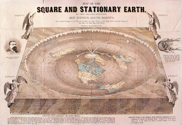
 The Bible Map of the World, 1893, by “Professor” Orlando Ferguson of Hot Springs, South Dakota, a geocentrist who created the map based on 400 passages in the Bible that supposedly describe what the Earth is like, and none of them supports the idea of a spherical earth, or one that revolves around the Sun.  Apparently, according to a 1996 Gallup poll, about 18% of Americans agree and believe the Sun revolves around the Earth. 

Map Addict then segues into the unfortunate saga of one of the most famous of all the mappae mundi, the Hereford map, which was to have been put on the block at Sotheby’s auction house by the Hereford Cathedral when they were strapped for operating funds back in the 1980’s.  This story transitions into a history of the Hereford mappa mundi, then on to John Ogilby’s 1675 Britannia “road atlas,” which he shows might have had an elaborate hidden subtext of support for Catholicism at a time when Catholics were under siege in Britain, and finally bringing in ex-Monty Python Terry Jones’ Great Map Mystery, a Welsh TV series that, in one episode, presented some interesting theory that the Britannia map was actually a cartographic blueprint for a French (Catholic) invasion of (Protestant) England and Wales. 
Next, Map Addict tackles the pagan aspects of the landscape and mapping by tracing sacred alignments, leylines, and features throughout the British Isles, which exist even in a “New Town” purpose-built in the 1960’s.  All this results in fascinating reading, and the feeling that you are getting the benefit of a long conversation with someone very knowledgeable about many, many things, and someone who can bring almost any topic around to his love of maps. 
            Chapter 7, “Carto Erotica,” continues the theme of pagan landscapes by delving into the mysteries of some of the giant erotic earthworks in Britain, such as the Cerne Giant, outlined in chalk, with his 30-foot long penis, created perhaps in Bronze Age times, around 1,400 BC, like the other chalk-hill figures in Britain which have been carbon-dated, but no one is really sure how old the Giant is.  To add to the mystery, the only way to really perceive what the figure is, you need a view from above, something possible only within the past century.  There are also the female equivalents, the recumbent goddesses, such as the Sleeping Beauty in the Outer Hebrides.  Exactly why these types of figures were created, and with great effort in the days before earth-moving machinery, is still unknown.  This leads nicely into a catalogue of many erotic place names, and how people back in the day named things unsqueamishly and honestly to reflect their actual purpose.  No beating around the bush here, as it were.  Before street maps were in common usage, people had to rely upon street names giving clues about the lay of the land.  This resulted in a quite literal nomenclature, such as Church Street, School Road, Tanners Row, Smith Lane, etc.  Every town had some version of a red-light district, amenable to prostitution and other vices.  Often these streets were picturesquely called “Gropecunt Lane.”  Many of these were renamed in more prudish times as “Grope Lane,” or “Grove Lane,” obscuring their original raison d’etre.  There were also streets called Hookers Court, Dunghill Lane, Pissing Alley, and Maiden Lane, a more euphemistic and “polite” title for a street providing the same services as in Gropecunte Lane. 
After the sexy map talk, it is only natural to focus on the issue of gender and maps, and in particular the theory that women can’t read maps, and moreover, are not very interested in maps.  Since this is along the same lines at the Royal Geographical Society’s pronouncement that women are incapable of being geographers, I read Chapter 8, “Boys’ Toys?” with interest and some annoyance, since I am apparently doing two things that women typically can’t do, which I find absurd.  So does the author, and he points out all the fallacies and holes in the theory. 
The penultimate chapter takes on modern technology, specifically satellite navigation systems (GPS) referred to as “satnav.”  While neither Mike Parker nor I are Luddites, it was refreshing to find someone who shares my dislike of the current trend of over-reliance on GPS for wayfinding.  Not only can it be dangerous (people ending up unexpectedly in rivers or on railroad tracks when their satnav systems erroneously direct them there), but it reduces peoples’ ability to appreciate the larger geography.  After all, when using satnav, we only see one tiny and fragmented part of the landscape at a time, and never really understand how it fits into the larger whole.  It removes geographic context, obfuscates distance, topography, topology, and history, and encourages even more geographic illiteracy amongst the populace, and that is definitely something we don’t need, based on the already abysmal understanding of basic geography demonstrated in many polls and surveys.  He also decries the use of Google “mash-ups,” while extolling the virtues of Internet map libraries and “good” uses of GIS, acknowledging that GIS has revolutionized geography in schools.  He’s enough of a die-hard paper map enthusiast, however, to believe that there will always be a need for paper maps, and that the digital turn in cartography will never totally replace “real” tangible maps. 
Throughout the book, Mike intersperses his personal recollections, observations, and ruminations of things geographical into the factual narrative.  The final chapter is the culmination of the personal aspects of the book, where he questions whether or not all this map-reading has reduced his enjoyment of traveling and experiencing life “in-the-moment.”  He wonders if having his head stuck in a map all the time has diminished his noticing important things in real life, and skewed his view of reality.  In other words, was he too much of a map addict for his own good?  He questioned whether “years of over-reliance on maps have dulled any innate sense of direction” after becoming hopelessly lost once when venturing out without a map in hand.  But he concludes that while it is good for the soul to go “off-map” occasionally, “it doesn’t feel right; indeed, it feels as if I am denying myself one of the main joys of walking in the first place, namely to compare the route on the map with the reality around me.”  Spoken as only a true map addict would. 

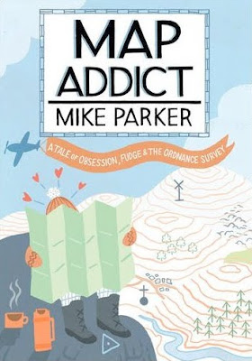
Map Addict, by Mike Parker, 2010, Harper Collins Publishers, London, UK
For more info about the Ordnance Survey, see http://www.ordnancesurvey.co.uk/oswebsite/
Interesting way to look at current and historic OS maps, side-by-side:
http://www.memory-map.co.uk/historical/