Monday, October 31, 2011

Rats in NYC! (Happy Hallowe’en Part 2)


311 Service Requests From 2010-Present Where Complaint Type is Rodent, by Gretchen Culp

Keeping with our macabre Hallowe’en theme for the day (see Zombie Map! at http://geographer-at-large.blogspot.com/2011/10/map-of-week-10-31-2011-zombie-map.html), here we have a wonderful example of a Hexbin method map, created by Gretchen Culp, cartographer extraordinaire and ace doctoral student.  She decided to try out the Hexbin method discussed in my blog posting from a couple of days ago (at http://geographer-at-large.blogspot.com/2011/10/hexbins.html), and created this terrific (and terrifying!) map of rodent complaints in NYC.  I love the way the legend is done!  This is a really nice map.  Even if there is an alarming number of rodent complaints in many areas.  UGH!  RATS!  

Map of the Week 10-31-2011: Zombie Map


Happy Hallowe'en!

           “How do you combine an obsession with Zombie movies and data analysis of Google Maps?
Simple, you produce the map, above.  It was created by Oxford University's Internet Institute - and the guys behind the fantastic dataviz site, Floating sheep: Mark Graham, Taylor Shelton, Matthew Zook and Monica Stephens.
Using a keyword search for "zombies", it visualizes the absolute concentrations of references within the Google Maps database.
It shows how Africa, where the word 'zombie' originally came from, misses out on those criteria.
Graham, whose favourite Zombie movie is the original Romero Dawn of the Dead (‘the classic of the genre’) says of the map:
The results either provide a rough proxy for the amount of English-language content indexed over our planet, or offer an early warning into the geographies of the impending zombie apocalypse.”  From: http://www.guardian.co.uk/news/datablog/2011/sep/23/zombie-map-world

Text written on the map itself:
“Using a keyword search for “zombies” the following map visualizes the absolute concentrations of references within the Google Maps database.  The map reveals two important spatial patterns.  First, much of the world lacks any content mentioning “zombies” whatsoever.  Second, and related, the highest concentrations of zombies in the Geoweb are located in the Anglophone world, especially in large cities.  The results either provide a rough proxy for the amount of English-language content indexed over our planet, or offer an early warning into the geographies of the impending zombie apocalypse. 
Visualization by Mark Graham, Taylor Shelton, Matthew Zook, and Monica Stephens.  This map and other visualizations can be found on the OII visualization website (Oxford Internet Institute, University of Oxford, UK) at www.oii.xx.ac.uk/vis" Check out the website for more interesting visualizations.

Sunday, October 30, 2011

Mapping the History of Poverty


“Poverty has fallen faster over the past 50 years than in the previous 500.  But 1.2 billion people still live in extreme poverty.”  From http://www.povertyover.org/

Mapping the History of Poverty (and some other cool socio-demographic mapping projects)
This is an informative and innovative interactive map that lets you see an animated timeline of countries, showing when (and if) they transitioned out of poverty, as well as the degree of their development (symbolized by color intensity).  You can also tilt the map and see the poverty/development data symbolized by height, higher representing an increased degree of development. http://www.povertyover.org/
Check out Cuba!  It is one of the few countries that rises and falls, most others just rise as time goes by, or stay flat.  See if you can pick out a few other anomalous ones that go back and forth in development status. 
I’m not sure that I like the way that “development” is seen as the opposite of “poverty.”  As if those are the only two choices!  And that increasing development (however THAT is defined!) is the solution to poverty! The "growth is good" mentality, regardless of how that can possibly be sustained in even the short-run,  is what is sending this world of ours into the downward spiral. Not to mention the often-overlooked fact that if everyone in the world had the standard of living that we in the US, Canada, and western Europe enjoy, the earth would run out of resources in about 3 months.   But I’m not going to get all hung up on semantics – the concept of the map and the data are pretty interesting. 


MigrationsMap.net
Where are migrants coming from? Where have migrants left?
Another very interesting demographic website is: http://migrationsmap.net/  This interactive map shows you, for any given country, in flow map format, where people who are migrating OUT of the country are going TO (“Departures”), and conversely, where people who are migrating TO the country are coming FROM (“Arrivals”).  They also quantify the populations on the move.  The basis of these maps is something called the Global Migrant Origin Database, and you can download the actual spreadsheets used, and read about the methods and limitations in the construction of the database at: http://www.migrationdrc.org/research/typesofmigration/global_migrant_origin_database.html


Population Pyramids, 1950-2050
             This is extremely cool!  View pop pyramids for individual countries, as well as world regions and globally, looking back to 1950, and projected forward to 2050, in 5-year increments. 
             Population pyramids are one of the best ways we have to explore the basic demographic structure of a place – they provide us with information on age cohorts, male/female ratios, and in most cases, absolute numbers of various population sub-groups.  According to Wikipedia, “a population pyramid, also called an age structure diagram, is a graphical illustration that shows the distribution of various age groups in a population (typically that of a country or region of the world), which forms the shape of a pyramid when the population is growing.  It typically consists of two back-to-back bar graphs, with the population plotted on the X-axis and age on the Y-axis, one showing the number of males and one showing females in a particular population in five-year age groups (also called cohorts).  Males are conventionally shown on the left and females on the right, and they may be measured by raw number or as a percentage of the total population.”  From: http://en.wikipedia.org/wiki/Population_pyramid
Generic Population Pyramids, showing the four main stages in demographic transition:

Example of a population pyramid from the Stage 1 “expanding” population category.  Nearly half of Libya’s 2011 population consists of youths under age 20.

America’s Demographic Opportunity – the Demographic Dividend
And as an important aside to the population pyramids, many of the more affluent countries are currently in the position of having “contracting” populations (the last stage in the demographic transition model, the last of the generic population pyramids).  This means that there are more people at the upper reaches of the pyramid (older populations, living longer) than there are younger ones.  This has serious implications for those nations where this is occurring, in terms of economic growth, employment, taxation, innovation, support for the elderly, and future development.  An interesting blog posting from New Geography recently detailed what this might mean for some of those contracting nations (Japan, Italy, etc.) and why the U.S. is not quite as badly off in terms of population numbers skewed toward the elderly.  I had sent this link around to those on my Listserv, but I include it again here, even though there are parts of it that I don’t agree with (as I rarely do with most of the New Geography posts! Especially their pro-urban sprawl tendencies).  Nevertheless, it is worth a read. BTW, notice how in the graph above, the legend and the symbols are shown incorrectly (they are reversed).  This was pointed out to me by an observant Jon Jenkins.  Thanks Jon, for your gimlet editor's eye for detail!  I looked at this graph dozens of times (and carefully, I thought!) and never noticed the error.  Of course, the little "%" symbols next to the numbers make the meaning clear, but STILL!  Shame on New Geography or whomever put these graphs together originally!
“Among the world’s major advanced countries, the United States remains a demographic outlier, with a comparatively youthful and growing population.  This provides an unusual opportunity for America’s resurgence over the next several decades, as population growth elsewhere slows dramatically, and even declines dramatically, in a host of important countries.” From: http://www.newgeography.com/content/002492-americas-demographic-opportunity?utm_source=feedburner&utm_medium=feed&utm_campaign=Feed%3A+Newgeography+%28Newgeography.com+-+Economic%2C+demographic%2C+and+political+commentary+about+places%29

The Spread of Immigrant Groups in the U.S.
And another really nice one on U.S. immigrant groups and their spread across the United States.  http://www.nytimes.com/interactive/2009/03/10/us/20090310-immigration-explorer.html
You can select specific nationalities or regions of origin, and the map changes from a multivariate choropleth to a proportional symbol map. You can also adjust the "bubble" size to see the detail better.  Thanks, Kristen Grady, for sending the link

Life expectancy across the U.S. / Global BMI and Diabetes
American women live an average of 2.5 years longer than men, but as life expectancies vary across the country, both men and women in certain counties, particularly in the South and Southeast, can expect to die more than a decade sooner than others.  See interactive map, where you can get data by county, at http://www.washingtonpost.com/wp-srv/special/nation/life-expectancy-map/

        Thanks, Urban Demographics, for the link.  On the same page, there is another link to an animated scatterplot showing how global BMI (Body Mass Index) has changed for men and women, 1980-2008, as a metric for cardiac risk. You can look separately at each nation, also.  Weight of the World:  http://www.washingtonpost.com/wp-srv/special/health/weight-of-the-world-bmi/
Another tab on that page shows Diabetes worldwide and for each nation. 


Bottom of the Heap
And, lastly, a sobering look at social justice in various nations around the world.  The United States, one of the overall richest countries in the world, is very low on the charts.  What does this say about the so-called "American Exceptionalism"? 
Table from: The New York Times, http://www.nytimes.com/imagepages/2011/10/29/opinion/29blow-ch.html?ref=opinion
from the editorial "American's Exploding Pipedream by Charles M. Blow at http://www.nytimes.com/2011/10/29/opinion/blow-americas-exploding-pipe-dream.html?nl=todaysheadlines&emc=tha212
"The differences in the prevention of poverty and access to educational opportunities are immense in the OECD.  The northern European countries are best of all at providing for equal opportunities for achievement. At the same time, many continental European and Anglo-Saxon states have considerable catching up." from the report at http://translate.google.com/translate?hl=en&sl=de&u=http://www.bertelsmann-stiftung.de/&ei=dh2rTqy2KsLh0QGgtJWPDw&sa=X&oi=translate&ct=result&resnum=1&ved=0CCIQ7gEwAA&prev=/search%253Fq%253Dhttp://www.bertelsmann-stiftung.de%2526hl%253Den%2526client%253Dsafari%2526rls%253
These (the successful nations) are the very countries that some of our would-be leaders in the U.S. deride as dangerous socialist welfare states.  Meanwhile, we (the U.S.) are literally at the bottom of the heap, just slightly above Greece, Chile, Mexico, and Turkey.  We are in the lowest category, "the bottom five," for Pete's sake!

Wednesday, October 26, 2011

Hexbins!


The Hexbin method as applied to the locations of all Walmarts within the United States.  By Zachary Forest Johnson.  from: http://indiemaps.com/blog/2011/10/hexbins/
What are hexbins, and why would one use them in cartography, data visualization, and spatial analysis?  Hexbinning is an innovative way of representing a large number of geocoded locations (points) on a map.  It is at once a great way to give a clear overview of the data, while also allowing the user or map reader to drill down to specifics about the data. 

“Binning can be good for both the users and the creators/developers of static or interactive thematic maps or other visualizations.  For the user, showing every single point can lead to cognitive overload, and may even be inaccurate, as overlapping points lead to a misreading of density.  A binned representation may reveal patterns not readily seen in the raw point representation of the data….The idea of hexagonal binning is to break a two-dimensional plane into different bins. First, the bins make interlocking hexagons. It is possible to use squares (or interlocking triangles or another shape), but hexagons look “rounder” than squares.
            Hexbinning consists of 1) laying a hexagonal grid or lattice atop a 2-dimensional field of data and 2) determining data point counts for each hexagon.  This says nothing of the symbolization or representation method that can then be employed to communicate these counts to the graphic’s reader…These [hexbin] plots are notable for allowing the user to simultaneously view generalities and retrieve specifics.” From http://indiemaps.com/blog/2011/10/hexbins/

“Hexagon binning is a form of bivariate histogram useful for visualizing the structure in datasets with large n.  The underlying concept of hexagon binning is extremely simple;
1. the xy plane over the set (range [x], range [y]) is tessellated by a regular grid of hexagons.
2. the number of points falling in each hexagon are counted and stored in a data structure.
3. the hexagons with count > 0 are plotted using a color ramp or varying the radius of the hexagon in proportion to the counts.
The underlying algorithm is extremely fast and effective for displaying the structure of datasets with n >/= 106.  If the size of the grid and the cuts in the color ramp are chosen in a clever fashion, then the structure inherent in the data should emerge in the binned plots.  The same caveats apply to hexagon binning as apply to histograms and care should be exercised in choosing the binning parameters.
Why hexagons?  There are many reasons for using hexagons, at least over squares. Hexagons have symmetry of nearest neighbors which is lacking in square bins.  Hexagons are the maximum number of sides a polygon can have for a regular tessellation of the plane, so in terms of packing a hexagon is 13% more efficient for covering the plane than squares.  This property translates into better sampling efficiency at least for elliptical shapes.  Lastly hexagons are visually less biased for displaying densities than other regular tessellations.  For instance with squares our eyes are drawn to the horizontal and vertical lines of the grid.  
When the data are plotted as squares centered on a regular lattice our eye is drawn to the regular lines which are parallel to the underlying grid.  Hexagons tend to break up the lines.”
From: Hexagon Binning: an Overview, by Nicholas Lewin-Koh

For more information see the following:
The Hex Bin method

Walmart locations all hexed up!


Monday, October 24, 2011

Map of the Week 10-24-2011: Best Topographic Map of Earth


The Advanced Thermal Emission and Reflection Radiometer (ASTER) instrument on NASA's Terra spacecraft provided this spacebird's-eye view of the eastern part of Grand Canyon National Park in northern Arizona. 
(Image:NASA/GSFC/METI/ERSDAC/JAROS, and U.S./Japan ASTER Science Team) from: http://www.mnn.com/earth-matters/wilderness-resources/stories/best-topographic-map-of-earth-unveiled

        The most complete digital topographic map ever made of the Earth was released by NASA last Monday (October 17th).  The map, known as a global digital elevation model, was created from images collected by the Japanese Advanced Spaceborne Thermal Emission and Reflection Radiometer, or ASTER, instrument aboard NASA's Terra satellite.
      "NASA and Japan released a significantly improved version of the most complete digital topographic map of Earth on Monday, produced with detailed measurements from NASA's Terra spacecraft.  
     The map, known as a global digital elevation model, was created from images collected by the Japanese Advanced Spaceborne Thermal Emission and Reflection Radiometer, or ASTER, instrument aboard Terra. So-called stereo-pair images are produced by merging two slightly offset two-dimensional images to create the three-dimensional effect of depth. The first version of the map was released by NASA and Japan's Ministry of Economy, Trade and Industry (METI) in June 2009.
     ‘The ASTER global digital elevation model was already the most complete, consistent global topographic map in the world,' said Woody Turner, ASTER program scientist at NASA Headquarters in Washington. 'With these enhancements, its resolution is in many respects comparable to the U.S. data from NASA's Shuttle Radar Topography Mission (SRTM), while covering more of the globe.’
     The improved version of the map adds 260,000 additional stereo-pair images to improve coverage. It features improved spatial resolution, increased horizontal and vertical accuracy, more realistic coverage over water bodies and the ability to identify lakes as small as 0.6 miles (1 kilometer) in diameter. The map is available online to users everywhere at no cost.
     ‘This updated version of the ASTER global digital elevation model provides civilian users with the highest-resolution global topography data available,' said Mike Abrams, ASTER science team leader at NASA's Jet Propulsion Laboratory in Pasadena, Calif. 'These data can be used for a broad range of applications, from planning highways and protecting lands with cultural or environmental significance, to searching for natural resources.’
     The ASTER data cover 99 percent of Earth's landmass and span from 83 degrees north latitude to 83 degrees south. Each elevation measurement point in the data is 98 feet (30 meters) apart.  
     NASA and METI are jointly contributing the data for the ASTER topographic map to the Group on Earth Observations, an international partnership headquartered at the World Meteorological Organization in Geneva, Switzerland, for use in its Global Earth Observation System of Systems. This 'system of systems' is a collaborative, international effort to share and integrate Earth observation data from many different instruments and systems to help monitor and forecast global environmental changes.  
     ASTER is one of five instruments launched on Terra in 1999. ASTER acquires images from visible to thermal infrared wavelengths, with spatial resolutions ranging from about 50 to 300 feet (15 to 90 meters). A joint science team from the United States and Japan validates and calibrates the instrument and data products. The U.S. science team is located at JPL.
     NASA, METI, Japan's Earth Remote Sensing Data Analysis Center (ERSDAC), and the U.S. Geological Survey validated the data, with support from the U.S. National Geospatial-Intelligence Agency and other collaborators. The data are distributed by NASA's Land Processes Distributed Active Archive Center at the U.S. Geological Survey's Earth Resources Observation and Science Center in Sioux Falls, S.D., and by ERSDAC in Tokyo.  
     Users of the new version of the ASTER data products are advised that while improved, the data still contain anomalies and artifacts that will affect its usefulness for certain applications."
      Data users can download the ASTER global digital elevation model at: https://lpdaac.usgs.gov/  or  http://www.ersdac.or.jp/GDEM/E/4.html
Text from: http://www.nasa.gov/home/hqnews/2011/oct/HQ_11-351_ImprovedTopoMap.html

 ASTER Global DEM image from 

At 14,505 feet (4,421 meters) in elevation, California's Mt. Whitney, located in the Sierra Nevada Mountains on the west side of Owens Valley, is the highest point in the contiguous United States. (Image credit: NASA/GSFC/METI/ERSDAC/JAROS, and U.S./Japan ASTER Science Team) from: http://www.ouramazingplanet.com/best-topographic-map-of-earth-2117/


Sunday, October 23, 2011

Contagion Diffusion – The Euro Crisis


The euro zone’s single currency makes it easy to shift money across borders from risky economies to safer ones.  That and the lack of central banks in each country -- those went away in 1999 with the arrival of the euro — make the euro zone “the ultimate contagion machine,” says Kenneth Rogoff, a Harvard economist.
Arrows show imbalances of debt exposure between borrowers in one country and banks in another; arrows point from debtors to their bank creditors.  Arrow widths are proportional to the balance of money owed.  For example, French borrowers owe Italian banks $50.6 billion; Italian borrowers owe French banks $416.4 billion.  The difference — their imbalance — shows France's banking system more exposed to Italian debtors by about $365.8 billion.
The risk to countries’ debts and economies is indicated by color. 
The euro zone’s single currency makes it easy to shift money across borders from risky economies to safer ones.  That and the lack of central banks in each country – those went away in 1999 with the arrival of the euro – make the euro zone ‘the ultimate contagion machine,’ says Kenneth Rogoff, a Harvard economist. 
Arrows show imbalances of debt exposure between borrowers in one country and banks in another; arrows point from debtors to their bank creditors.  Arrow widths are proportional to the balance of money owed.  For example, French borrowers own Italian banks $50.6 billion; Italian borrowers owe French banks $416.4 billion.  The difference – their imbalance – shows France’s banking system more exposed to Italian debtors by about $365.8 billion.  The risk to countries’ debts and economies is indicated by color.  From: http://www.nytimes.com/interactive/2011/10/23/sunday-review/an-overview-of-the-euro-crisis.html?nl=todaysheadlines&emc=thab1
         Many of you undoubtedly remember the topic of geographic diffusion from Geography 101 or the equivalent class.  You know, the four major types of spatial diffusion: relocation diffusion, expansion diffusion, hierarchical diffusion, and contagion (or contiguous) diffusion.  The New York Times this morning published a very nice set of interactive graphics explaining the current situation with the Euro debt crisis, and how it’s all connected in one big old global web.  They use the term “contagion diffusion,” which strictly speaking from a spatial analysis perspective, is not an entirely correct use of the term.  However, if you have any confusion about the problem with the Euro and how Greek debt can influence events in the U.S. and worldwide, it is worthwhile to read the short text accompanying the graphics, and to poke around in the interactive graphics a bit.  And I think the term "contagion diffusion" is a more-or-less apt description to get the main point across, although in this case the contagion or contiguity is not referring to geographic contiguity but to monetary contiguity, since the countries influencing one another are not necessarily geographically contiguous, but are connected via this non-spatial network of money. Maybe, to coin a new term, it could be called "network diffusion" since the diffusion is occurring via the international monetary network, as opposed to any of the other typical types of diffusion. If anyone has a better name for it, please let me know!   In any event, the Times showcases here some good examples of conceptual flow maps, and as usual, the Times graphics are excellent.  I am slightly envious of the high school kids in our GISc Science Academy this summer who got to take a field trip to the New York Times graphics dept. 

      Check out the six different conceptual flow diagrams which give an overview of the crisis at:  http://www.nytimes.com/interactive/2011/10/23/sunday-review/an-overview-of-the-euro-crisis.html?nl=todaysheadlines&emc=thab1


The Four Major types of Spatial Diffusion.  From: http://www.spatial.maine.edu/~max/KEH_i21.html

The euro zone’s single currency makes it easy to shift money across borders from risky economies to safer ones.  That and the lack of central banks in each country -- those went away in 1999 with the arrival of the euro — make the euro zone “the ultimate contagion machine,” says Kenneth Rogoff, a Harvard economist.
Arrows show imbalances of debt exposure between borrowers in one country and banks in another; arrows point from debtors to their bank creditors.  Arrow widths are proportional to the balance of money owed.  For example, French borrowers owe Italian banks $50.6 billion; Italian borrowers owe French banks $416.4 billion.  The difference — their imbalance — shows France's banking system more exposed to Italian debtors by about $365.8 billion.
The risk to countries’ debts and economies is indicated by color. 


Monday, October 17, 2011

Map of the Week 10-17-2011: Gridded Population Cartogram of China

The equal-population map shows a gridded population cartogram in which every grid cell is resized according to the total number of people living there.  From: http://www.viewsoftheworld.net/?p=1738
Thanks, Kristen Grady, for sending me the cartogram!

         
Many of you (and ALL of you who have had a GISc class with me!) probably know by now that I LOVE cartograms.  And I have been a huge fan of Danny Dorling and his Cartogram Factory for years (and by “Cartogram Factory” I am not alluding to some Dickensian assembly line of cartogram makers, but something more akin to Andy Warhol’s Factory of unique and cutting-edge creativity, but maybe minus some of the decadence!). 
Cartograms, or value-by-area maps, are a very innovative type of thematic map whereby the geographical areas are depicted not by their actual geographic size (as is usual on most maps) but are sized by a function of some ancillary variable, such as population, GDP, or life expectancy, for example.  In other words, the variable to be mapped is substituted for land area in showing the size of the geographical units.  According to the “Cartogram Central” website of the University of California at Santa Barbara, http://www.ncgia.ucsb.edu/projects/Cartogram_Central/types.html there are three types of cartograms: contiguous, non-contiguous, and Dorling.  See Danny Dorling’s World Mapper website at http://www.worldmapper.org/  and also see Gretchen Culp’s review of the book Atlas of the Real World: Mapping the Way We Live, by Dorling, Newman, and Barford, at http://geographer-at-large.blogspot.com/2011/02/atlas-of-real-world-mapping-way-we-live.html


WorldMapper's Grid-Based World Population Cartogram (2000), focusing on sub-national level data, from the ESRI website at http://www.esri.com/news/arcuser/0110/cartograms.html

WorldMapper's World Population Cartogram based on national level data, from  http://www.esri.com/news/arcuser/0110/cartograms.html

One of the potentially problematic issues with cartograms is that in order for the map viewer to correctly interpret the cartogram, s/he has to be familiar with the original geography of the mapped area.  If not, then the re-sizing of the units of analysis based on the ancillary variable (in the case of the map above, by population) will be meaningless.  This is one of the oft-cited drawbacks of cartograms, and I suspect, one of the main reasons why they haven’t become as widely-used as choropleth maps or dot density maps.  This drawback can be at least partially mitigated by including a map of the standard geography of the mapped area as a kind of a “locator” or reference map, which becomes even more important when the geography in question is likely to be poorly understood by the map viewer.  The map of China shown here does just that, making it easier for those not very familiar with China’s geography able to discern the areas of high population concentrations, and where there are relatively smaller populations.
A few months ago, I wrote a post about the newly emerging mega-regions, one of which was the Pearl River Delta area in China. http://geographer-at-large.blogspot.com/2011/02/megaregions-is-this-our-future.html  This mega-region was being touted as potentially the largest city conglomeration in the world, with over 40 million people.  The British Telegraph Newspaper stated: “China is planning to create the world’s biggest mega city by merging nine cities to create a metropolis twice the size of Wales with a population of 42 million.”  http://www.telegraph.co.uk/news/worldnews/asia/china/8278315/China-to-create-largest-mega-city-in-the-world-with-42-million-people.html
       The map above was created to counter, or at least temper, some of the hysterical buzz surrounding this story.  The cartogram’s creator, Benjamin D. Hennig of the University of Sheffield’s SASI group, says “This map makes the plans of a more integrated Pearl River Delta region more understandable, and perhaps slightly less exciting for those who interpreted the news as the creation of a new megacity, rather than the logical step in connecting an already populous region.” http://www.viewsoftheworld.net/?p=1738
See the SASI post and slide show on creating gridded population maps at Re-Mapping the World’s Population in ArcUser and Slideshare http://www.viewsoftheworld.net/?p=701
See their PDF of creating cartograms for data visualization at http://www.viewsoftheworld.net/data/ArcUser2010_hennigetal.pdf

As shown in the two world population maps above, there is a big difference in mapping data at tha national level versus at the sub-national level using the gridded approach.


Saturday, October 15, 2011

Where is YOUR Antipode?


This map shows the antipodes of each point on the Earth’s surface – the points where the blue and magenta overlap are land antipodes - most land has its antipodes in the ocean.  This map uses the Lambert azimuthal equal area projection.  The magenta areas can be considered to be opposite reflections of the blue areas but on the inner ‘surface’ of the globe of the Earth.

The same map, from the perspective of the Western Hemisphere.  Here the blue areas can be considered to be opposite reflections of the magenta areas but on the inner ‘surface’ of the globe of the Earth, from http://en.wikipedia.org/wiki/Antipodes

Where is YOUR Antipode? 
(and some other cool stuff!)

What’s an antipode, anyway?  Some of you geographers may know the term, or you may be familiar with it just from reading the journal “Antipode,” with its subtitle “A Radical Journal of Geography.”  Or it’s possible you’ve read the journal but never wondered what the name meant!  BTW, if you don’t know about this journal, check out their website at http://www.antipode-online.net/default.asp
“In geography, the antipodes of any place on Earth is its antipodal point; that is, the region on the Earth's surface which is diametrically opposite to it.  Two points which are antipodal to one another are connected by a straight line through the centre of the Earth.” From http://www.antipodemap.com/   A line drawn from one place to its antipode passes through the center of the Earth and forms a true diameter.

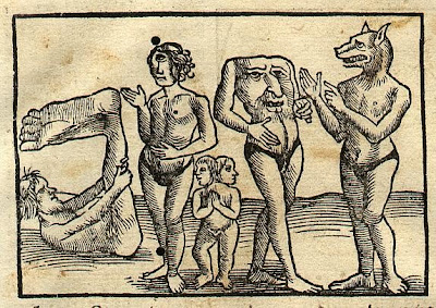
I really enjoy saying “Antipode,” (pronounced `an-tep-ode, with the emphasis on the first syllable) but even more, I love saying its plural “Antipodes,” (pronounced an-`tip-o-deez, with the accent on the second syllable).  The word derives from the Greek words for “opposed” (anti-) and “foot” (pod or pous), or under the feet, opposite.  Later on, the Latin usage changed its meaning to “those with feet opposite,” a race of people with feet sticking out of their heads, or people who were inverted and walked on their hands with their legs sticking up in the air, which is what the population on the other side of the world was imagined to be doing.  These were common mythical creatures that mediaeval map makers often drew in unknown places to fill up the space.  These up-side-down people living at the opposite side of the earth were known as Antichthones, another great word!  They took their place on mediaeval maps and marginalia right next to the dog-faced race and the sciapods! "Yonder in Ethiopia are the Antipodes, men that have their feet against our feet." (from the earliest usage in English of  the word "Antipodes," from a 1398 translation of Bartholomew of England's "The Properties of Things," a kind of proto-encyclopeadia in 19 volumes written in Latin in 1240).

An interesting thing about the antipodes is that the concept was recognized by the ancient Greeks, (Plato, Aristotle, Plutarch, Strabo, and Diogenes) demonstrating their understanding of a spherical world.  In contrast, the early Christians found the idea of antipodes to be absurd, requiring a belief that people in the antipodes were inverted, because, of course, being on the other side of the world and all, they couldn’t possibly stand on their feet like we do!  Popes and clergy declared the very notion of antipodes to be heretical, because it would require a belief that, since all people descended from Adam and Eve, descendants of Adam and Eve would have had to have gotten in a boat and traveled over seas to the southern lands, (which were not even known in those times with any certainty to exist).  From the point of view of scriptural inerrancy, the fact that the Bible doesn't mention anything about this at all means that it could not be possible.
        As a digressive aside, if you are interested in sciapods and other mediaeval beasts, or mediaeval topics in general, pick up a copy of the 2003 book "Baudolino," which tells a fabulous tale involving Prester John (the lost Christian king of the East) and touches upon all the major themes of the day (early 12th century Constantinople): The Fourth Crusade; the troubadours; the legend of the Holy Grail; the rise of the cathedral cities; the position of Jews; the market in relics; the local rivalries that made Italy so vulnerable to outside attack; the perennial power struggles between the pope and the emperor, and the geographic location of the Earthly Paradise.  One of the main characters is a sciapod!  This mythical epic story is by Umberto Eco, of "Foucault's Pendulum" and "The Name of the Rose" fame.  All of them are worth reading. 
Back to the Antipodes: By going to the website http://www.antipodemap.com/  you can click on your location on the top map, and the bottom map will show you your antipode.  Pretty cool. 
Kristen Grady originally sent me the following link to New York City’s antipode, which apparently is somewhere in the ocean southwest of Australia, near an iceberg twice as large as Manhattan.  It’s Iceberg B-17B, and it’s a calfed-off part of the Ross Ice Shelf of Antarctica.  http://toolserver.org/~geohack/geohack.php?pagename=New_York_City&params=-40.716667_N_106_E_scale:10000000_type:city&title=The+Antipodes+of+New%20York%20City

Although it seems strange that our antipode is an iceberg in the middle of an ocean, actually it is about what we would expect.  After all, over 70% of the earth’s surface is covered by ocean, and the land masses of the southern hemisphere are particularly skimpy.  So the antipode of just about anywhere in the northern hemisphere is likely to be in the middle of the ocean.  Less than 4% of the earth’s land masses are antipodal to land. 
The way you can calculate your antipodal location by lat-long is to figure that the latitude will be identical, except with the direction reversed.  For example, the latitude of the antipode of 40o N will be 40o S.  The antipodal longitude will be 180o difference between the two points, with reversed direction, resulting in a location at 74o W having an antipode at 106o E.
x° N/S y° E/W    x° S/N (180 − y)° W/E
Noon at a location is midnight at its antipode, and summer solstice is winter solstice
  
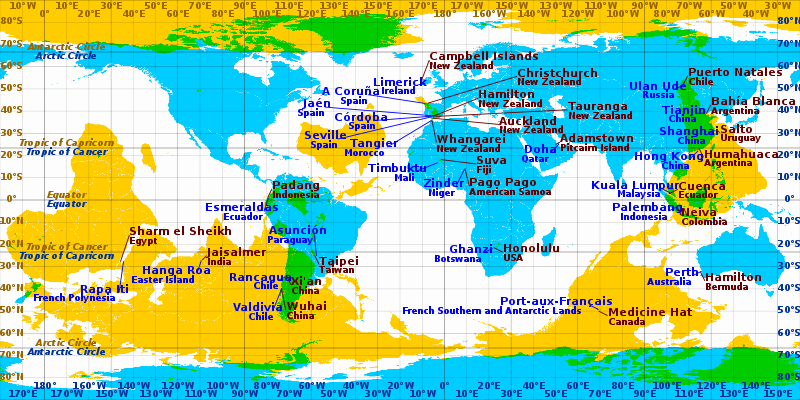
Some cities and towns which are near-antipodes in equirectangular projection. Blue labels pertain to cyan and brown labels pertain to yellow areas. Areas where cyan and yellow overlap (coloured green) are land antipodes.


Find your Center of Gravity
             In a similar vein, here is another cool website sent to me by Ms. Grady.  With this one, you plug in all the places you have ever lived, and the program calculates the geographical center of all your residences, weighted by number of years or months spent there.  You can also do it without weighting it by time.  It’s really interesting.  I entered all my addresses (if you don’t remember the exact street address, you can just put in city and state), every place I could remember where I spent more than about 2 months of my life.  Anywhere I had a “room of my own,” in other words.  With all the different places I’ve spent significant time, when I weighted it by years, my center of gravity ended up being along the Old Montauk Highway, Suffolk County, Long Island (NY).  This is primarily due to the overwhelming number of years I spent at various addresses in NYC, which pretty much cancels out any years spent anywhere else.  I never even lived in Long Island (not that there's anything wrong with it!) When I entered the same addresses without the time weighting, my center of gravity was way up in Maine, for some odd reason!  http://www.geomidpoint.com/

The “What Was There” Project
      This one is from Lesley Kunikis.  Check it out!  Some pretty cool stuff! 
“Thought this might be of interest to you: http://whatwasthere.com/  The What Was There project was inspired by the realization that we could leverage technology and the connections it facilitates to provide a new human experience of time and space – a virtual time machine of sorts that allows users to navigate familiar streets as they appeared in the past.  The premise is simple: provide a platform where anyone can easily upload a photograph with two straightforward tags to provide context: Location and Year.  If enough people upload enough photographs in enough places, together we will weave together a photographic history of the world (or at least any place covered by Google Maps).  So wherever you are in the world, take a moment to upload a photograph and contribute to history!” 

Manhattan on vacation in Chicago
Manhattan travels to other cities...
     And another one from Kristen Grady:  “This is kind of adorable…”  http://www.radicalcartography.net/index.html?manhattan
Scale Comparisons by Bill Rankin.  “Inspired a bit by Rem Koolhaas’s Floating Pool project, I wondered what would happen if Manhattan itself decided to take a tour of the oceans, stopping at other cities to refuel and have a good time.  Overwhelmed by LA’s vastness, Manhattan decides to stay offshore, while it snuggles in close and completely overwhelms Boston (and inadvertently obliterated Logan Airport).” (From Radical Cartography, Bill Rankin’s website).  See Manhattan nestling up to various other cities.  So cute!  

New York's Bike Requests as a Map of the City's Yuppies
     This is about NYC’s new bike sharing program, and apparently the 600 or so bike locations are being decided by web voting.  The only problem with this is that the less affluent parts of the city seem to not be voting with the fervor of the more gentrified and yuppified sections, or, dare I say it, those populated by the dreaded hipster. This seeming lack of interest from the less affluent sections of the city denotes, perhaps, less Internet access, less interest in biking, or less disposable money to pay for the yearly bike sharing license.  

A detail of the previous version of New York City’s subway map, left, and this year’s simplified edition.
A Village Street Slips off the Subway Map
              This one is from Cordelia Nervi. 
“Here's a fun story about the new subway maps, complete with a Lehman shout-out.” http://cityroom.blogs.nytimes.com/2011/10/10/a-village-street-slips-quietly-off-the-subway-map/?hpw
It never ceases to amaze me how things are decided in this world, cartographic decisions included.


Monday, October 10, 2011

Map of the Week 10-10-2011: Scotland’s Greenspace Map


Detail of Scotland’s Urban Greenspace Map
UK Ordnance Survey
Thanks, Andrew Maroko, for sending me the link

“Scotland's Greenspace Map is a world first; no other country has mapped its greenspace in this way.  This interactive map provides information about the type and extent of greenspace in urban Scotland (i.e. towns and cities with a population of over 3000).  It was compiled in 2011 from greenspace data provided by the 32 Scottish Councils.”  

The interactive map itself:

The interactive map opens up showing all of Scotland and a good bit of northern England as well.  Glasgow, for instance, (my future home!) appears as a huge and many-tentacled green blog, indicating that Glasgow has lots of greenspaces, especially, it appears, along linear corridors.  However, if you really, really zoom in, (zoom to four or five levels below the top – the website says to at least 1:18,056, but since there is no scale on the map, that is singularly unhelpful advice!) you can see all the types of greenspaces differentiated as to playgrounds, civic centers, sports facilities, public parks and gardens, green corridors, natural and semi-natural greenspaces, private gardens and greenspaces, golf courses (it IS Scotland, after all, and golf courses run rampant!), cricket greens, tennis courts, transportation rights-of-way, churchyards, cemeteries, community allotments (similar to our community gardens), school grounds, woodlands, etc.  The more zoomed in you get, the finer the categorization of the types of greenspaces.  There are 23 primary types and a number of secondary types of greenspaces included. 
It’s very interesting how they’ve managed to include even all the private greenspaces in the whole country.  Their methodology included using aerial photo interpretation of Open Survey Mastermap to produce a GIS data layer showing primary (and where appropriate, secondary) typologies for each greenspace polygon.
The standard methodology used to map Scotland’s greenspaces is detailed in the Urban Greenspace Mapping and Characterisation Handbook, available as a free pdf downloadable at:
            This is a very worthwhile document to peruse, and the level of detail and explicitness is commendable. 

PS – STUDENTS!  TAKE NOTE!  THIS is what a good methodology report should look like.  It includes a data dictionary, data needs assessment, metadata, explanation of how things were categorized, and full description of analyses undertaken.  From this handbook, and assuming access to the same data, anyone would be able to duplicate the work done.  This is what needs to be compiled at the end of a research project, and it makes an impressive appendix to the dissertation!

The Greenspace Scotland organization’s website:

Tuesday, October 4, 2011

Geographical Bigotry - The Amazing Racism!


Excerpt from the Coudersport, PA, 15-minute USGS quadrangle map (1938)

         In the wake of all the brou-ha-ha about the offensive name of the Texas hunting camp of Rick Perry (one of our erst-while Republican Presidential hopefuls for 2012 election),  I was reminded of the wonderful book by Mark Monmonier, “From Squaw Tit to Whorehouse Meadow: How Maps Name, Claim, and Inflame,” University of Chicago Press, 2007.  This book deals extensively with pejorative toponyms (the name of a place or geographical feature) on government maps.  “In the early twentieth century, it was common for towns and geographical features to have salacious, bawdy, and even derogatory names….Placenames are far more than simple markers of location; they are social constructions which create, define and validate the particular reality desired by the namers,” from http://www.markmonmonier.com/from_squaw_tit_to_whorehouse_meadow__how_maps_name__claim__and_inflame_39898.htm
     If you haven’t read this book (or anything else by Monmonier) then you are in for a treat.  Check out his website for a listing of his books - all provocative takes on some great cartographical/geographical topics, while weaving in the hidden ramifications of our mapping choices, the subtext inherent in all maps, and what it reveals about us. 


Excerpt from the Commodore, PA 7.5-minute USGS quadrangle map (1993)


And then I thought I would share with you guys this very amusing clip from the Jon Stewart Daily Show from last night (October 3rd).  Some masterful reporting on the topic, and some classic quotes! When Jon Stewart asks the reporter in the field (ostensibly in front of Nigger Lake in upstate New York) what all these derogatory and insensitive place names say about America, the reporter responds "It says there aren't enough black people making maps!"


from: http://www.thedailyshow.com/watch/mon-october-3-2011/the-amazing-racism---geographical-bigotry


Monday, October 3, 2011

Map of the Week 10-3-2011: Emotion Mapping

Greenwich (U.K.) Emotion Map by artist Christian Nold - commissioned as part of ‘Peninsula.’


“[Emotion Mapping] is revolutionary methodology and tool for visualising people's reactions to the external world.  Over the last five years, [2004-on-going] over 2000 people have taken part in community mapping projects in over 25 cities across the globe.  In structured workshops, participants re-explore their local area with the use of a unique device invented by Christian Nold which records the wearer's Galvanic Skin Response (GSR), which is a simple indicator of emotional arousal in conjunction with their geographical location. On their return, a map is created which visualises points of high and low arousal.  The unique methodology of this project involves working with groups of people to interpret and analyse the data and adding annotating onto these individual emotion tracks. Through this process communal Emotion Maps of lots of people's emotion data are constructed which are packed full of personal observations and highlight the issues that people feel strongly about.” From http://biomapping.net/
“The [Greenwich] project involved weekly workshops with 80 local Greenwich Peninsula residents with the aim of re-exploring the area afresh with the help of a Bio Mapping device.  The resulting ‘Emotion Maps’ encourage personal reflection on the complex relationship between oneself, the environment and one’s fellow citizens.  In a group, people then commented about their experiences and left annotations on the map. 

To create the communal Greenwich Emotion Map all the individual walks were aggregated to visualise a shared landscape of emotion.  The map contains particular arousal hotspots reflecting many of the local discussions about regeneration of the Peninsula.  As part of the commission we printed 1000 Greenwich Emotion Maps which have turned out to be a great success communicating the project locally as well as nationally and internationally.  Locally every participant received a map and a number are available at the tourism office but the map was also distributed through arts venues such as the ICA and Tate Modern bookshops.  While this participatory project is now at an end, the local discussions about physical and social change in the area are continuing and we hope the map will play a strong part in this discussion.” from: http://www.emotionmap.net/background.htm  


Partial view of the San Francisco Emotion Map [You can also see examples of Chris Nold’s Emotion Mapping from other cities, including San Francisco, California, at http://biomapping.net/].   
“The (44MB freely downloadable) book Emotional Cartography - Technologies of the Self [http://www.emotionalcartography.net/] is a collection of essays from artists, designers, psycho-geographers, cultural researchers, futurologists and neuroscientists, brought together by Christian Nold, to explore the political, social and cultural implications of visualizing intimate biometric data and emotional experiences using technology.  The theme of this collection of essays is to investigate the apparent desire for technologies to map emotion, using a variety of different approaches.”  From: http://infosthetics.com/archives/2009/04/emotional_cartography_implications_of_visualising_intimate_biometric_data.html


Above: Cover of Emotional Cartography: Technologies of the Self, edited by Christian Nold

Christian Nold | Emotional Cartography | Photo: Kevin Ruellan
from: http://www.bouillants.fr/b2-le-volume-vern-sur-seiche/


The Psychogeography of Loose Association, by Sherif el-Azma
I’ve also become interested in the related theme of Psychogeography.  The term psychogeography dates back to at least 1955 - as then defined by Guy Debord - as the study of how cities are organized, and of how their various levels of organization affect individuals who live and work in them, move through them, use them, and explore them.  I have recently stumbled across the work of Sherif el-Azma, a Cairo-based video artist who has created a “live performance lecture” called “The Psychogeography of Loose Association.”

Here is a quote from the lecture:
“Psychogeography is a practice that rediscovers the physical city through the moods and atmospheres that act upon the individual.
Perhaps the most prominent characteristic of psychogeography is the activity of walking. The act of walking is an urban affair, and in cities that are increasingly hostile to pedestrians, walking tends to become a subversive act.
The psychogeographer is a 'non-scientific researcher' who encounters the urban landscape through aimless drifting, experiencing the effects of geographical settings ignored by city maps, and often documenting these processes using film, photography, script writing, or tape. In this way, the wanderer becomes alert to the metaphors, visual rhymes, coincidences, analogies, and changing moods of the street."  From: http://consonantsigns.tumblr.com/post/10556457895/psychogeography-is-a-practice-that-rediscovers-the

Sherif el-Azma's Cairo
And here is a description of the lecture:
“The lecture-performance of Sherif el-Azma deals tentatively with the 'mechanics of enframing’ through architecture in the megalopolis of Cairo. Out of a reservoir of personal memories and free associations the artist tries to reconstruct an historical, architectural situation. In his artwork, he employs artistic and architecture-related practices such as maquettes and 3D-modelling to reproduce architectural situations. His main interest is to renegotiate positions of cultural and social representation.
The lecture takes place on the occasion of the presentation of the book Cairoscape - Images, Imagination and Imagin ary of a Contemporary Mega City, published by argobooks in 2009, and documenting the homonymous exhibition, curated by Marina Sorbello and Antje Weitzel at Kunstraum Kreuzberg/Bethanien in Berlin in 2008.  In this show, Sherif el-Azma presented his photo installation and performance The Psycho-Geography of Loose Associations, representing the mega-city of Cairo through psycho-geographical investigation.”  From:

Here is a very illuminating peek at the “research actions” of The Cairo Psychogeographical Society, who, although possibly inspired by Debord and the Siuationist International, are more in the vein of urban explorers, weekend warriors, and hobbyists, and their work has more to do with practice than theory.  Check out some of their quite surprising urban musings at http://www.e-flux.com/journal/view/90

Deep Topographer, Nick Papadimitriou, The London Perambulator
For those of you who have stayed with me this far, here is something else very cool on this general topic that has caught my attention.  The Deep Topographer as Le Flâneur.  I have posted both the short video clip, followed by the full-length documentary, for those of you whose interest has been piqued.
The London Perambulator is a documentary (about 45 minutes long) about Nick Papadimitriou, deep topographer/deep-time spelunker of Middlesex, England.  Commentary is supplied by friends Will Self, Russell Brand and the maestro, Iain Sinclair. A sort of a modern take on the concept of Le Flâneur. (See my blog post at http://geographer-at-large.blogspot.com/2011/08/le-flaneur.html if you missed Le Flâneur.)


Short Clip

Full length documentary