“Geography, sir, is ruinous in its effects on the lower classes. Reading, writing, and arithmetic are comparatively safe, but geography invariably leads to revolution.”
(1879 testimony before a Select Committee of the House of Commons, London, England, regarding expenditures of the London School Board)
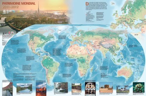
“The latest version of the World Heritage map, produced by the UNESCO World Heritage Centre and National Geographic Maps with the generous support of Russian Federation, can now be ordered for a modest fee from the World Heritage Centre website. The featured image on the Map presents Saint Petersburg, where the next session of the World Heritage Committee will be held (June/July 2012).
The World Heritage map is an educational visual tool, allowing UNESCO to communicate its work in this field on a large scale. It is especially important since print documents, accessible to everyone, are an essential communication tool.
The map features the 936 World Heritage properties, brief explanations of the World Heritage Convention and World Heritage conservation programmes, as well as superb photos of World Heritage sites with explanatory captions. The dimensions of the map are 78 cm by 50 cm (31 by 20 in.), and it is available in English, French, and Spanish versions. A Russian version will also be produced this year.”
The list of the sites, and an interactive map, is at http://whc.unesco.org/en/list The interactive map allows you to see all the sites by category, and clicking on a site brings up a detailed description, including a brief history of the site, why the site was chosen to be listed, what UNESCO listing criteria it meets, and lots of photos. It's nicely done and quite interesting.
I have been to a number of these sites, including three just last summer, during my trip to the International Medical Geography Symposium in Durham, UK: Durham Cathedral and Castle; Roman Empire Frontiers (Hadrian's Wall); and Greenwich Maritime outside of London. The World Heritage sites are never less than spectacular. Check out the list by country - The US has quite of few sites (of which I am ashamed to say I've only visited 10 of them). The UK, Germany, France, and Italy all have many sites, but the list is far from overwhelmingly Euro-centric. Going quickly through the list, I see that I have visited about 150 of the sites (including a couple that have been designated recently as "endangered"), and of course, my "bucket list" includes seeing the remaining 800 or so sites! Probably won't get to all of them!
Just something peaceful for the day after Christmas. This map (by David McCarter) shows where the Dutch artist Vincent van Gogh (1853-1890) lived, and depicts the European countries as being made up of parts of van Gogh’s paintings. This map puts me in mind of a lab assignment from the Geovisualization and Analytical Cartography class last year in which students were asked to create a map in the style of a well-known artist. For some of the very creative results, see http://geographer-at-large.blogspot.com/2011/02/bogus-art-maps.html
“David McCarter is a Geography Graduate student at California State University, Northridge, where he is specializing in Cartography and GIS. Ever since he can remember, he has had a strong interest in both art and maps. When it came time for college, he almost opted to be an art student but finally choose geography because of how incredibly diverse that field is.
Late last year, he figured out a new way to fuse fine art with his maps by using paintings to represent different political divisions. He came up with the concept during a final project for a graduate cartography seminar. The final project was to create a map that was outside of the box. He came up with several ideas, but felt that none of them were outside of the box enough, and perhaps not outside at all. Finally he decided to make a map showing the locations that one of his favorite artists, Vincent Van Gogh, lived while he painted his masterpieces. After playing around for a while with different ideas on how to display the data to best help the map reader not only know the locations of where Van Gogh lived, but also represent Van Gogh himself, he decided to have Van Gogh paintings represent the different countries. France was represented by Starry Night, etc. This fused two of his passions together: cartography and fine art.
Since that time, David McCarter has made a wall map of the United States where each of the 50 states is represented with a painting by an American artist (such as Norman Rockwell, Mary Cassatt, and Charles Marion Russell) and a wall map of Italy where each of the 20 regions is represented with a painting by an Italian artist (such as Leonardo da Vinci, Michelangelo, and Raphael). Other geographic data that is displayed on the United States and Italy maps include capitals, major cities, and major rivers.
Merry Christmas! A topographically correct Christmas tree ornament!
OK, couldn’t resist doing a Christmas-themed posting! And I found out that in my soon-to-be-home in Scotland, they call this "the festive season," which of course reminded me of George Constanza's father on the old Seinfeld sitcom who wanted to change the name of the Christmas holiday season to the non-denominational "Festivus," with his catchy slogan "Festivus for the Rest of us!" So, whether you are celebrating Christmas, Hanukkah, Kwanzaa, Winter Solstice, or nothing more than "Peace on Earth, Good Will towards All," I wish you a happy and peaceful season. And festive, of course!
Here are some seasonally-appropriate maps, including one from our friends at NOAA depicting the probability of a White Christmas in the U.S.; The one right below is the ACTUAL forecast of a White Christmas for 2011.
Santa’s Special Places Map, showing Christmas-related toponyms;
Map showing the locations of communities who engage in filling up jars of change for the poor (??!!), from a website called christmasjars.com;
And of course, don’t forget the ever-popular NORAD Santa-tracker. If you have small kids who still “believe,” this is a cool activity you can do on the computer or smart phone at the NORAD website on Christmas Eve. The North American Aerospace Defense Command does this every year, and it is actually pretty fun to watch in real time. How does he get around the world delivering all those gifts in one night? Now you can find out! http://www.noradsanta.org/en/index.html#utm_campaign=en&utm_medium=ha&utm_source=en-ha-na-us-bk-gm&utm_term=norad%20santa
And, can’t let the holiday season get us all treacle-y and sentimental – Here’s some holiday-themed graffiti to sober us up! (Thanks, Urban Demographics blog, for posting this photo.)
A map of endonyms of the world’s nations – what the people living there actually call their country. See the interactive map at http://endonymmap.com/ and notice the four smaller maps in each corner showing the Anglophone, Le Monde Francophone, the Hispanofonia, and the Arabic-speaking world.
“Some language facts: The most common official or national language in the world is English, with 86 countries or territories. These jurisdictions represent roughly one-third the number of total countries and approximately 30% of the planet's land area. After English, the most common official languages are French, Spanish and Arabic. Combined, these four languages are used officially in 157 countries, about two-thirds of all countries.”
What is the nature of “place” and “space”? What is the difference between the two terms? People in different cultures perceive place and space differently. This is made evident in the names they assign to places. We call these names of geographic features and places “toponyms.” (from the Greek τοπος / topos – place, and ὄνομα / ónoma, - name.)
When people get to chose their own names for places and features in their home landscapes, we call those “endonyms.” When the names are assigned from others outside the culture, we call them “exonyms.”
The more precise definitions are as follows (from “The Nature of the Endonym” by Paul Woodman, Working Paper No. 1 from the United Nations Group of Experts on Geographical Names, 2009):
"Endonym: Name of a geographical feature in an official or well-established language occurring in that area where the feature is situated. Examples: Vārānasī (not Benares); Aachen (not Aix-la-Chapelle); Krung Thep (not Bangkok); Al-Uqşur (not Luxor). From ένδον / endon = within."
"Exonym: Name used in a specific language for a geographical feature situated outside the area where that language is widely spoken, and differing in its form from the respective endonym(s) in the area where the geographical feature is situated. Examples: Warsaw is the English exonym for Warszawa (Polish); Mailand is German for Milano; Londres is French for London; Kūlūniyā is Arabic for Köln (in English, Cologne). The officially romanized endonym Moskva for Mocквa is not an exonym, nor is the Pinyin form Beijing, while Peking is an exonym. The United Nations recommends minimizing the use of exonyms in international usage."
The theme of space and time (including the relation to toponymy) has been explored by many scientist-philosophers, including Plato, Aristotle, Ptolemy, Newton, Descartes, Wittgenstein, Einstein, and the philosopher-geographer Yi-Fu Tuan, who coined the term “topophilia” to denote the fondness and love one feels for a specific place. "..the affective bond between people and place or setting..." (Topophilia: A Study of Environmental Perceptions, Attitudes, and Values, 1977.)
The Algerian toponymist, Brahim Atoui, wrote that “One names in order to delimit, to isolate, identify, distinguish, demarcate, and also and especially to give value.” (from Introduction à la notion d’espace et de limite contenue dans un nom de lieu,Introduction to the concept of space and limits contained in a place name, 1998.)
Many cultures recognize that human life is bound up inextricably with the land, and lest we think this people-land connection is felt mainly by aboriginal and tribal societies, any number of “western” writers and artists spring to mind as having described what most of us, regardless of cultural background, have felt – the attachment and reverence for place, home, the locus of memories, repository of the past, symbol of our place in the universe.
Bird’s Eye View of New York by John Bachmann, 1866
In the 18th and 19th centuries, these bird’s eye views of locations were very popular. They combined the virtues of a map with a 3-D representation of the landscape, and more often than not were not true bird’s eye views, but oblique views, shown on an angle. They are called, variously, bird's eye views, panoramic maps, or perspective maps. The web site http://www.bigmapblog.com/ has many of these, and all are worth looking at. In the past, nearly every large city, and many much smaller towns, had their streets and landmarks memorialized in a bird's eye view map. Some of them are amazingly detailed, showing every ship in the harbor and every window in buildings. They were the Google Street Views of their day.
This one, of NYC, features mainly Manhattan, as usual. However, this is OK, since historically speaking, NYC was not “Greater New York City” until 1898, and this map dates from 1866, prior to consolidation. Basically, NYC WAS Manhattan, back then. Brooklyn was a separate city altogether, and Queens was a collection of small villages and farming communities. The Bronx and Manhattan were two parts of the same county up until then. The five boroughs did not join up to become what we now think of as NYC until 1898. Coincidentally, NYC was consolidated the same year as the US starting building its overseas empire in earnest, acquiring, Guam, Puerto Rico, The Philippines, and Hawai’i. Hmm, I never made the connection before: I guess NYC was just jumping on the expansionist bandwagon when it incorporated the other boroughs!
In any event, you can see that when this view was drawn showing the city as it was in 1866, there is nothing higher than the church steeples. A few years later, with the advent of the Otis elevator, and the steel frame construction enabling “skyscrapers,” all that would change forever.
Details from Bachmann's map - boats in the harbor, above, and City Hall, below. Amazing!
“The thorny problems with perspective mapping of NYC were finally solved rather spectacularly by the German graphic artist turned cartographer Herman Bollmann. In the late 1940s Bollmann began drawing picture-plans, orbildkarten,of European cities using an oblique “optically modified” axonometric projection. Initially Bollmann drew his maps by direct observation using a light table in the field and by the 1960s was employing a special camera (mounted on a VW). HisNew York Picture Map,published in 1962 by Pictorial Maps, was by far his most ambitious project. Over the course of only eight months, aided by 17,000 aerial and 50,000 ground photos, Bollmann and his staff created a map that not only showed an unobstructed view of Midtown, nearly to perfect scale, but included a remarkable level of architectural detail. Kevin Brown of Geographicus called it 'one of the greatest cartographic feats of all time.'” From Codex 99 athttp://www.codex99.com/cartography/110.html, where you will find more on specifically New York City bird’s eye and panoramic maps, including the Bollman map.
Detail, Rockerfeller Center, Panoramic Map of NYC, by Herman Bollman, 1962
For a brief history and examples of United States and Canadian panoramic maps, 1847-1929, see the Library of Congress American Memory Project site at:
A plan of the city of New York. Publisher: William Bradford. Source: New York Public Library Digital Gallery. The slave market structure is shown as a black square along the lower (East River) coastline of Manhattan, about mid-way between the drawings of the sailing ships. It was situated at the top of the Wall Street slip, a canal like body of water that separated two quays (or "keys" as they are indicated on this map). North is on the right in this map, east is on the bottom.
Today, December 13th, marks an important anniversary in New York City.Three hundred years ago, on December 13, 1711, the City Council passed a law “that all Negro and Indian slaves that are let out to hire…be hired at the Market house at the Wall Street Slip…” This market, known as the Meal Market (because grains were sold there), was located at the foot of Wall Street on the East River.It was the city’s first slave market.Although it had been located on the shores of the East River, subsequent landfilling resulted in the site of the Slave Market now being located several blocks inland, at what is now the intersection of Wall Street and Water Street.
A modern version of the map showing the slave market on the right. Here, north is top, and east (and the East River) is on the right hand side of the map.
I did not know anything about this slave market before a few days ago, when a blog reader wrote a comment on my post about the African Burial Grounds at http://geographer-at-large.blogspot.com/2011/01/african-burial-grounds-update-and.html Despite my fairly extensive knowledge of New York City history, I was not aware of the existence of the slave market. Now, I DID know that New York City, at one point, had more slaves than any city in the nation, second only to Charleston, South Carolina, but for some reason I never really thought about what that would mean in terms of the logistics of buying and selling African and Indian people, the actual financial exchanges, and the need for a centralized place to conduct this business. Naturally, there would have to be a slave market. And once this was brought to my attention by the blog reader, a person from a group called Occupy Publishing, I figured I’d like to find out more.
Apparently the market was deemed to be necessary because when slave masters had little or no work for their slaves, they were sent out to roam around the streets looking for work to hire themselves out to do. This haphazard arrangement made some of the white residents very nervous. So they built a centralized place where people looking to hire workers could go. After a time, the market was viewed as an eyesore and an obstruction of the views of the East River (“the agreeable prospect of the East River”), and was evidently especially offensive to those people traveling back and forth to the Coffee House (the original site where merchants traded stocks, and which eventually became the NYC Stock Exchange). In 1762, the slave market structure was torn down.
Ironically, the corner of Wall and Water Streets where the 18th century Slave Market was established was very close to the headquarters of the Amistad Defense Committee (122 Pearl Street near Hanover Street) at the offices of silk merchants Lewis and Arthur Tappan, abolitionists who organized the defense committee and were among the founders of the American Anti-Slavery Society in December 1833. In 1834, their office was attacked by a pro-slavery mob. http://www.huffingtonpost.com/alan-singer/new-york-was-the-land-of_b_594016.html
This is the text from the law itself:
1711. Law Appointing a Place for the More Convenient Hiring of Slaves
Source: Minutes of the Common Council of the City of New York, vol. II, 458, December 13, 1711. Be it Ordained by the Mayor Recorder Aldermen and Assistants of the City of New York Convened in Common Council and it is hereby Ordained by the Authority of the same That all Negro and Indian slaves that are lett out to hire within this City do take up their Standing in Order to be hired at the Markett house at the Wall Street Slip untill Such time as they are hired, whereby all Persons may Know where to hire slaves as their Occasions Shall require and also Masters discover when their Slaves are so hired and all the Inhabitants of this City are to take Notice hereof Accordingly. From:
There are many historic sites in the city having to do with the institution of slavery, the enslaved people themselves (both African and Indian), and the contributions of these people to the building of the city and the New York story. Some of these sites are described in the Mapping the African American Past (MAAP) website at Columbia University. http://maap.columbia.edu/place/22.html One relatively modest way to commemorate this part of our history would be to erect a series of signs at the important sites.
Here is another couple of websites with some good information on the slave market era.
Another interesting technique to map pop density: The ever-interesting United States population. Where do we live? Where don't we live? This is a nice map using a quasi-3-D topographical technique to depict population density. This shows better than most population density maps, I think, the extremes in the high and low density areas of the country - the peaks and the flatlands, so to speak.
And as an interesting side-note to this pop density map, and in the spirit of the Re-Regionalizing the American Continent post of several months ago (http://geographer-at-large.blogspot.com/2011/03/re-regionalizing-american-continent.html), here is a map showing how the United States could be divided up into states more equally by population. Each “state” shown here would have approximately the same population, about 40 million, plus or minus. This is what it would look like if every state was as populous as California, with over 37 million people.
And here’s what the U.S. would look like if the land were divided up according to wealth of the population (the famous 1-percenters would, of course, own quite a lot. The top 10% (the top 1% + the next top 9%) would own virtually the entire country. The bottom 90% of us would own about 1/8 of the land mass, by my scientific eye-balling it estimation.
In this interactive map, you can look at educational attainment by everyone, men, women, black, Hispanic, Asian, predominantly wealthy counties, poor counties, black counties, Hispanic counties.
I found this interactive map through the Indigenous Mapping Network – it apparently is one of the first participatory mapping projects for the Congo Basin in Africa. Participatory Mapping or Community-based Mapping is something that I have been interested and involved in for quite a long time now, starting in my graduate school days, through the time I helped start a community-environmental justice advocacy GISc mapping initiative in the South Bronx in the mid-1990s, and continuing to the present. It is sometimes also called “Counter-Mapping” to show that it is an attempt to create spatial information about a place that will challenge the “official” view of the area, and offer an alternative perspective, based on the lived experience of the people who inhabit the geography.
The Rainforest Foundation UK created the interactive “Mapping For Rights” maps, and they have also produced a nice series of short videos explaining the participatory mapping process, how it’s done, and why it is more beneficial to the affected community (not to mention the benefits of accuracy and correct representation of the data being mapped) than just having experts come in and do the mapping themselves on behalf of the community. Most of us who are aware of the importance of participatory mapping to secure indigenous rights probably think we know all these things already, but it is very instructive to have it all explained from the point of view of the community, and these videos do a good job of that. The progression from “ground mapping,” to sketch mapping, to GPS/GISc mapping, to 3-D mapping, to Internet mapping, and how the community participates in each of these activities and why each is an important step in the process, reveals the high level of patience, effort, and time that necessarily goes into facilitating a community mapping project.
Participatory mapping of this type is most frequently thought of as having the objective of obtaining or codifying the rights of people to fully use and own their traditional land and the resources on it without interference from outsiders looking to profit from the land and evict the original inhabitants, and therefore generally focuses on tribal peoples in relatively remote or rural areas, especially those areas that are rich in the resources valued by governments and corporations. Participatory mapping has been used effectively in Central and South America, Southeast Asia, Alaska, and amongst the First Nations peoples of Canada, to mention just a few, in order to retain, recoup, or formally legalize their fishing rights or rights to harvest traditional resources. In South Africa, participatory mapping was used to redistribute farming land equitably after apartheid ended, to maximize black people’s chances of obtaining productive agricultural land that had previously been denied to them through forced relocation schemes.
In the case of the South Bronx and other urban areas where counter-mapping has been practiced, it is not so much about rights to the land itself but the right to live on land which is free of pollution and its harmful health and other life impacts. In other words, it is environmental health justice that is being sought. So in the end, it is still about access to and control over the natural resources one needs to live – whether it is traditional hunting or fishing grounds, forest products, or clean air to breathe.
“Mapping For Rights, an initiative of the Rainforest Foundation UK, aims to support indigenous peoples and forest dependent communities to secure rights to their land and livelihoods through the use of participatory mapping. This short video shows how mapping can help to address problems faced by these communities from logging, mining, and other threats as well as being a powerful tool for land use planning and developing new forms of community-based forest management and protection.” From: http://www.youtube.com/watch?v=qRhYktaBWYg
Here are three examples from three different Congo Basin countries of the participatory mapping project. There are many more on the website http://www.mappingforrights.org/ as well as some fascinating information on the tribal groups and their culture and geographies. In the maps of the territories which have been made interactive, you can click on each individual community for more information.
“In 2007-8, the Natural Resources Network (Reseau Ressources Naturelles or RRN) and several of its partner organisations, with the support of RFUK and the Rainforest Foundation Norway (RFN), mapped community resource use in the Inongo territory in what was one largest exercises of its kind ever undertaken in Africa. A total of 408 community mappers from 200 communities were directly involved in data collection covering two of the three sectors in the territory - Basengele and Bolia - chosen due to their population density and accessibility.
The maps produced demonstrate the extensive overlap between customary areas and those of other external actors such as logging companies and conservation agencies, and have been used to support communities' efforts to gain rights to these areas. The exercise has also served as a test site to provide input into the national pilot forest zoning programme for DRC, supported by the The Food and Agriculture Organization (FAO) of the United Nations (UN) and the World Bank, to ensure that the rights of indigenous and local communities are taken into account.
The project also achieved a great deal in terms of increasing Congolese capacity in participatory mapping and approaches, the use of GIS and in terms of engagement in and influencing local and national decision making processes. Due to the success of the project, mapping activities were extended to cover all provinces of DRC by the beginning of 2009.”
“In order to address these land- and resource-related conflicts, government agencies, in partnership with conservation organisations currently responsible for the management of the Park, have developed a new draft zoning plan which divides the Park into zones with well-defined natural limits: (1) one fully protected zone (marine and inland) which excludes all human habitation; (2) an eco-development zone in which sustainable and controlled exploitation of natural resources by the park's residents can be authorised; and (3) a 5km buffer zone outside the protected area in order to mitigate impacts in the area.
The communities in and around the Park are using participatory mapping to support them in exercising their rights and defending their interests in the process of validation of the new zoning plan. They have produced maps that are helping them to express the importance of their lands and resources to local authorities and other decision makers, in order to encourage their active participation in the ongoing decision making processes.”
“With support from the Centre for Environment and Development (CED) and Rainforest Foundation UK, participatory mapping has been carried out with Baka communities in Nezam, Ando'o and Adjap, starting in 2001. The objective of this exercise was to support these communities to produce a map of their lands and to compare this to the provisional zoning plan for forest regions. This was the first time that this approach, involving concerned indigenous communities throughout the process, had been undertaken anywhere in the Congo Basin. This pilot phase allowed us to support the map production of about 13 more villages including Djouzé, Mebane, Bidoumba, Nyabibété, Mfem, Miatta, Alop, Minko'omesseng, Mveng, Nkolenyeng, Okweng, Djouzé and Akonetse.
This work was undertaken with the National Institute of Cartography (NIC), which provided technical support in the form of training in the use of GPS, data collection and the finalisation of maps.”
New visualization technique to map population density, by Fathom at http://fathom.info/dencity/ The map also highlights the 20 most populous cities in the world today.
“Dencity maps population density using circles of various size and hue. Larger, darker circles show areas with fewer people, while smaller, brighter circles highlight crowded cities. Representing denser areas with smaller circles results in additional geographic detail where there are more people, while sparsely populated areas are more vaguely defined.”
This map was created in response to the new milestone our planet has reached in being the home to more than 7 billion people. This map shows it’s not about absolute quantity, it’s about density. Not only are the dots smaller and closer together in the more densely populated parts of the world, but they are also brighter, which intuitively makes us think of these highly populated areas as glowing and vibrant. Perhaps this represents a little bit of unintended editorializing through visualization (or "visualitorializing," to coin a new word) on Fathom's part, or maybe even subliminal message-making, but these high-density areas DO tend to be the incubators of innovation and invention. In a bit of a twist on typical cartographic convention, such as in proportional symbol maps, the smaller dots signify MORE of the quantity being mapped.
“China. The largest city in the world is Beijing, with 17.8 million people. China is home to six of the twenty most populous cities in the world, more than any other country.”Gridded Population Density Map by CIESIN from: http://sedac.ciesin.columbia.edu/gpw/maps/globaldens.pdf
Our friends and colleagues at CIESIN (Columbia University’s Center for International Earth Science Information Network) wonder if this Dencity map is an improvement over their own gridded population map, and whether or not it is showing anything new. Although ostensibly they are both mapping the same population density data (more-or-less: the CIESIN map is based on Year 2000 data and the Fathom map is based on more current population data), I would say that the Fathom map, first of all, is more gorgeous, and second of all, probably does a better job of highlighting the bursts of population density, and making it much more obvious where population density is most intense. It gives a better overall snapshot of population density at-a-glance, although it's very likely that the CIESIN method produces a more accurate and "scientific" map. See CIESIN's data and methodology at http://sedac.ciesin.columbia.edu/gpw/
Of course, grid-based cartograms are another way of depicting population density (as reviewed on a recent blog posting at http://geographer-at-large.blogspot.com/2011/10/map-of-week-10-17-2011-gridded.html)
As you know, I usually try to stay away from politics in my blog - or, at least, overt references to politics, at any rate! Of course, any of my regular blog readers have probably figured out by now that I am an unreconstructed progressive/left-of-left/ex-hippie/patriotic-but-not-nationalistic-citizen-of-the-world. And somewhat radical, but in a low-key, conventional sort of way, especially now as I’m entering my dotage! My tear gas days on the barricades are over, regrettably. In other words, or actually, in the words of William Safire, the speechwriter for Spiro Agnew, our infamous and disgraced 39th Vice President of these United States, I am a distinguished card-carrying member of the “effete corps of impudent snobs who characterize themselves as intellectuals.” Or, perhaps I am even a “nattering nabob of negativity.” Take your pick, he lobbed all those alliterative epithets at us, and worse, during my formative years.
Notwithstanding, I felt that I had to break my own guidelines of non-partisanship when this crazy map came to my attention today, and it was just too weird and sad not to share with all of you. It comes from a Herman Cain brochure entitled “Foreign Policy and National Security - Herman Cain’s Vision: Peace Through Strength and Clarity.” This map is the center piece of Cain’s vision for foreign policy. It’s hard to imagine a more simplistic and jingoistic view of the world, and he put it in writing! And made a map of it!
He vows in this brochure to make America respected “once again,” but IMHO, this map and the policies it purports to represent is not going to do the trick. Au contraire, in fact. It’s insulting to America and to just about everyone else! It’s also really sloppy thinking, and, well, what’s the opposite of rigorous? He uses terms that are not defined and seem duplicative. What’s the difference between a “rival” and a “competitor,” anyway? Or a “friend and partner” and a “friend and ally”? Hard to figure. Plus, as an extra bonus, the document is full of mis-information and outright un-truths about President Obama's policies and positions (trying to be diplomatic here, and not call them “lies”). But, hey, kudos to Cain for being the first 2012 candidate to use a map as a central part of their campaign!
OK, I’m off the soap box now. Just take a look for yourselves. And if anyone has seen any other GOP crazy-time maps, PLEASE let me know! HA HA! http://corporatestatesofamerica.com/archives/74
Thanks, Keith Miyake, for your comment below about Thomas Barnett's map, which I've added to the post. I personally do not find a tremendous amount of congruence between Barnett and Cain's worldviews, but the Pentagon's New Map (2003) is very interesting in its own right.