Cartogram of the world,
showing the number of times various countries around the globe were mentioned
by the candidates in the 3rd Presidential Election this week. Very nice map by Michael Porter, one of CUNY’s
own, and now a health geographer heading up the GIS unit at a major NYC
agency.
So we find ourselves now in the
home stretch leading up to the US Presidential Elections, and I would like to
share with you some of the clever and informative election theme maps that have
been making the rounds.
Interactive change-the-scenario maps
The first series of maps are
interactive, where you, the map viewer, can change the map by altering the
scenarios for the electoral votes by state.
The New York Times
The Wall Street Journal – shows important “issues” in each
state, as well as whether Obama- or Romney-leaning
Real Clear Politics interactive map of electoral college
votes
CNN You can create your own map looking at different
scenarios in the battleground states
Huffington Post, same interactive deal as the others, the
second link showing a “cartogram” (really a sort of a proportional symbol map)
The Historical Perspective
One thing that strikes me as I look
back on the history of Presidential election results is the extreme closeness
of most races. It seems that the 50-50
divide in our country is nothing new.
Most of the elections have been won by just a very small margin of the
popular vote. 46% to 48%, etc., even one
that was 48.4% to 48.6%. What a
squeaker! There have been only a few
landslides in the popular vote, such as Teddy Roosevelt’s 1904 election (56% to
37%), and FDR’s 1936 election (61% to 36%) and a few notable others, but
generally the popular vote is only within a few percentage points, when there
are two major candidates running. In
several elections, the insertion of a third party candidate has basically served
as a spoiler for one or the other of the major party candidates.
Another interesting thing to look
at is the cases when the popular vote is very, very close, within a percentage
point or two, and yet, the electoral college map looks like a landslide for one
party or the other. And of course there
are the famous times in our history when a candidate has won the popular vote
but lost the electoral college vote, memorably with the Al Gore/George W race
in 2000.
For the historical perspective, see
Maps of the electoral college results in US elections since
1789
Isarithmic history of the 2-party vote
“Using county-level data, I
spatially and temporally interpolated presidential vote returns for the two
major party candidates in each election from 1920-2008. The result illuminates
the sometimes gradual, sometimes rapid change in the geographic basis of
presidential partisanship.”
Here’s his take on the same election data, shown in
choropleth maps.
The 2008 Election results
Interesting look at the 2008 election results, including
some cartograms and clever use of color to indicate intensity of results.
Civil War Divisions vs. the 2012 Electoral Map
And from Common Sense Democracy, a comparison of the 1864
Civil War Divisions and the 2012 Electoral Map (as of August, 2012)
Electing a US President in Plain English
If you are as confused as many
Americans are about how this whole electoral college thing works, here’s a good little animated video
that explains it all “in plain English.” All, that is, except for Nebraska and Maine, which don’t follow the rest of the states
and are even more confusing, and I don’t think this video bothers to tackle
those two anomalous states. I like the
cute cartoons of the states.
http://www.youtube.com/watch?v=ok_VQ8I7g6I&feature=related
Swing States
The rest of the electorate can just sit quietly and have a beer? Haha! Don't you believe it! Everyone should get out to vote, even the so-called "safe" states.
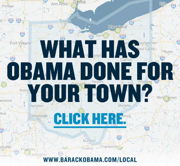
How the last four years affect YOU
This is not exactly a map, but it is an
interactive report by town (based on zip code) for an accounting of how Obama
administration policies have benefited your town. It's pretty impressive,
actually, and it seems would refute most of the hyperbole surrounding the
"what has Obama actually accomplished?" and "are you better off
than you were four years ago?" type questions. Plug in your zip code
at the website here to see for yourselves. In addition to the zip code
specific listing of accomplishments in energy, jobs, health care, taxes, small
business, education, etc., there is also a map of your area with pins to
designate sites where programs are directly linked to Obama Recovery Act
policies and funding, and you can mouse over them and it will tell you how
many jobs were directly created by each.
www.barackobama.com/local

And here is our current (and future?) President, looking
carefully at a world map, as all national leaders should be doing at least once
a day.